How to Brand a Webinar: A Comprehensive Guide

One of the biggest reasons people complain about their webinar platform is that they cannot brand the webinar experience for their viewers. The webinar platform they're using finds their own brand more important than that of their customer.
Weird. We know.
- Every marketing on planet earth
On the flip-side, you could of course choose a white-labeled webinar solution such as Goldcast. But with prices easily going over $20k this is not an option for most businesses.
So what is the best platform to host branded webinars? And how do you do it?
The best webinar platforms for branding your webinar
Full disclosure, this article was written by Contrast – and we're a webinar company. We put a lot of love and energy on making our customers their brands shine on Contrast. We wrote about why here.
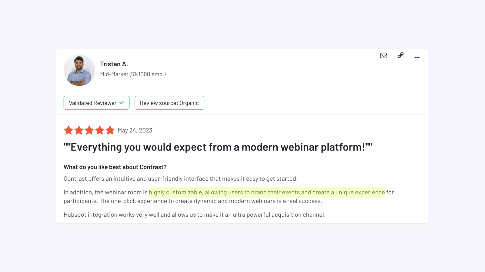
As you can see from Tristan's review, we're not the only ones who believe that.
So for this article, we're going to use examples from our own webinar platform and show you how easy it is to create a branded webinar. By the way, everything we discuss in this article is available on every plan. For free.
If you're looking for another platform, then these are also worth considering in terms of branding:
- Livestorm makes it possible to add logos and virtual backgrounds. You can also brand the registration page color. Finally, through plugins you can brand the webinar platform – but using plugins isn't the best experience.
- Session allows you to brand a lot during your webinar. But a lot less before the webinar. It's also less great for bigger marketing teams.
- Crowdcast is a platform mostly attuned to communities as they say on their website. But their branding options are great!
Why it's important to brand your webinars
You worked hard at creating your brand. Not only is your brand about how things look, it's also about how it makes your prospects and customers feel. You want them to experience that feeling all the time. Not just when they're on your website.
Besides this more philosophical reason. There's another reason.
Having an inconsistent funnel hurts your conversion rates and possibly also attendance rates. People get lost and end up closing your tab because they forgot how they ended up on this webinar registration page they didn't remember anymore because it looks like nothing they are familiar with.
Finally, if you're thinking of using your content on for example on YouTube or LinkedIn, then it's even more important. We'll explain you why in a bit.
How to brand your webinar
For this article, we're only going to look at regular webinar platforms. That means, we're not going to look at white-labeled solutions because these are often way too expensive for the average buyer.
It's important to look at what you can brand. Luckily webinar platforms have evolved. There's more you can brand than just adding your logo. In this article, we're going to look at 2 things:
- What can you brand on the video/webinar
- What else can you brand on the webinar platform?
Branding the webinar video itself
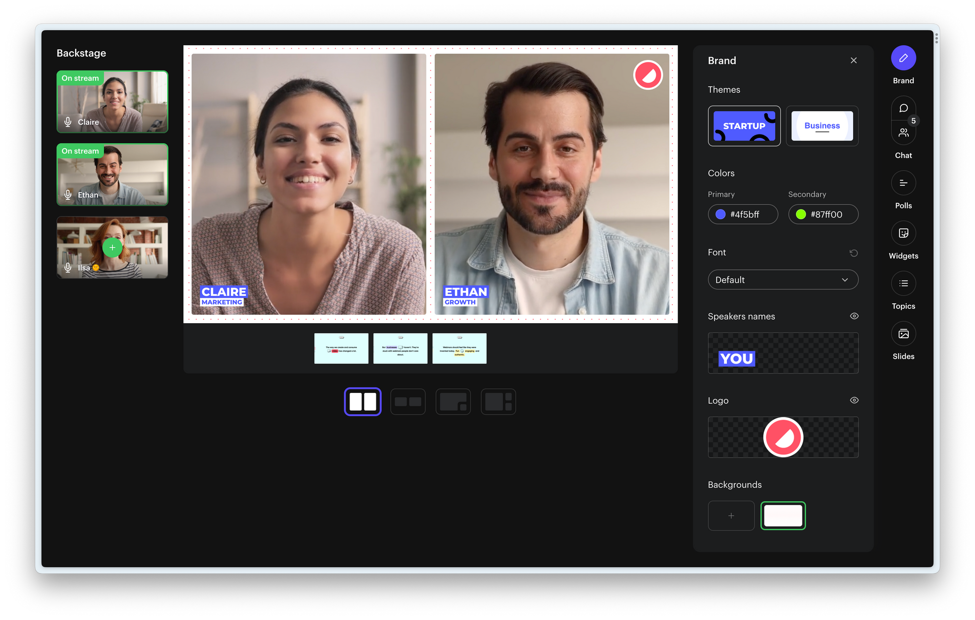
Choosing logos and backgrounds for your webinar
At a minimum, you should be able to add your logo to your webinar. But let's be honest, you need more than that. You should look into platforms that allow you to upload a custom background. This will add a professional, modern and branded look to your webinar.

Another option is a virtual background. But make sure that your team all has the same background, because otherwise it might look very busy and messy. Our friends from Livestorm have this feature.
How to brand your speaker names
Your speakers are your most important assets. You want to highlight who they are and what they do. Just like on TV. But very often webinar platforms make these way too small and don't allow you to style them.
Look for webinar platforms like Contrast, that allow you to change your name and role but also change the look and feel of your speaker names. For example on Contrast, you can style them using your brand's colors but also fonts.
Fonts
This one is a bit unusual maybe. And not something everyone needs. But if really want to hit it home with your webinars, look for a webinar platform that allows you to choose your own font.
Themes
One thing you want to avoid is having to call your developers to customize your webinar platform to make it look branded. This means, you give up a tiny bit of flexibility in favor of simplicity.
How to create webinars that are branded and engaging
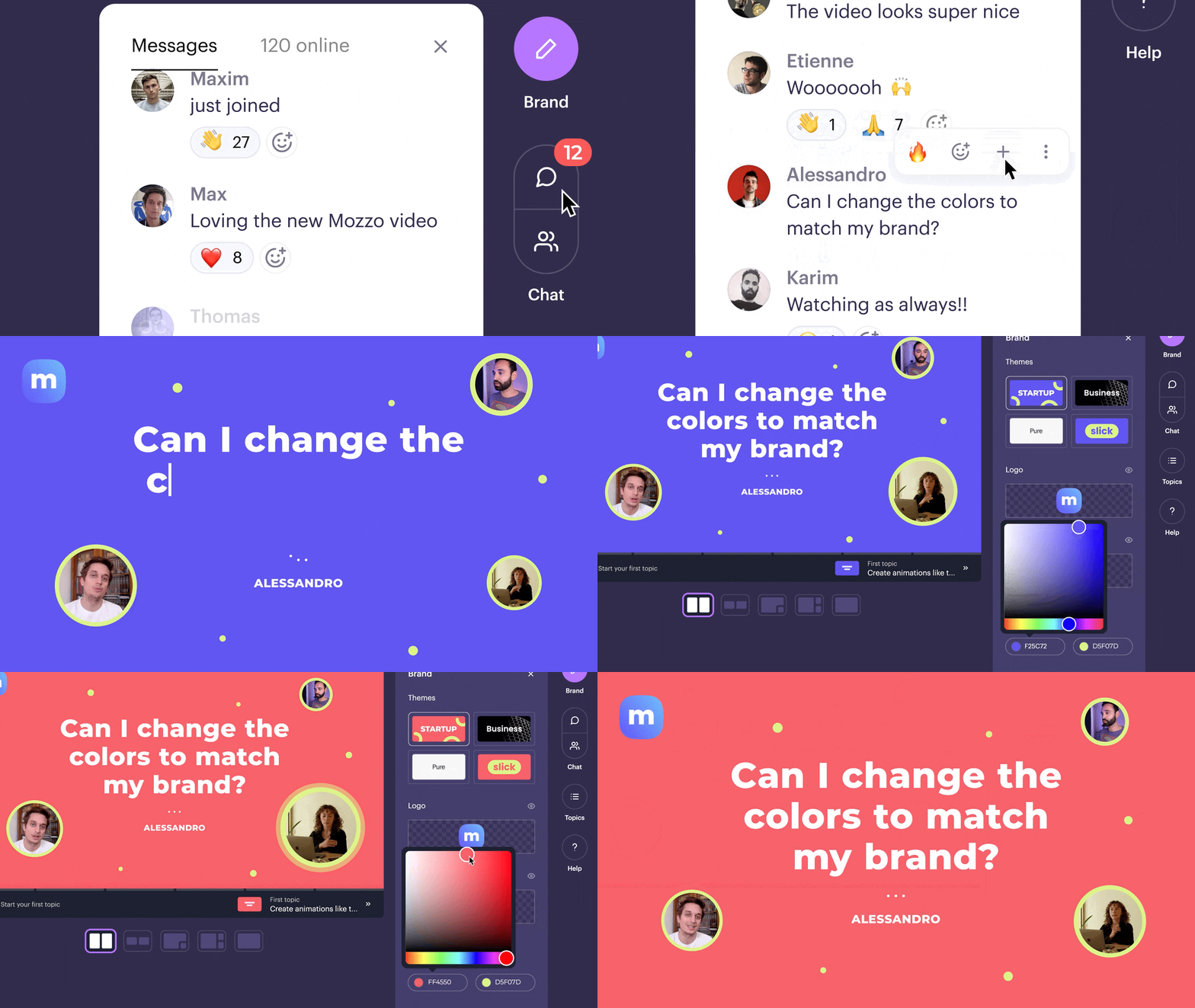
Contrast makes it super simple to change the entire look and feel of your webinar by introducing themes. They work like templates on PowerPoint. In a single click you can change the theme and by that the look and feel of your webinar. Of course, respecting your logos, backgrounds, colors and fonts.
Why you should care about branding the webinar
If you want to be successful with webinars, you need to look for ways of getting more value out of them once they're over. Of course we're talking about replays. But there's more you should consider.
Upload your webinar to YouTube
If you would create a YouTube video for your company, you would make sure that it's branded, right? Well, why then not with your webinars? Exactly.
This is why you need to make sure that there's more than a little logo on top of your webinar to let your brand shine through. Because if you don't have that, you'll end up spending a lot of time in video-editing and making the webinar feel more branded.
Repurpose your webinar
To get more value out of your webinars, you should repurpose them. Share small snippets on social media to build thought-leadership and also get new registrants to your replays.
But you want to avoid having to hire a video-editor to make your videos look branded. This is why you should look for a platform where your brand is baked into the video. Like on Contrast.
Branding the webinar platform
Ok, there are 2 things you need to look out for. The registration page and also the webinar page itself. Most webinar platforms these days allow you to upload a cover image and your logo. But again, that's not enough to make your webinars feel branded.
How to brand the registration page of your webinar
You should look for a webinar platform that allows you to change more than just the image or logo on your registration pages. You need a solution that allows you to change the colors and by that the look and feel of your registration pages.
There's a few platforms that allow you to do this by using CSS. But then you need a developer. And you know how that works..
Contrast makes it super simple to do this. You only have to select your brand's primary color and using an algorithm they will style the rest of your registration page.
How to brand the webinar live experience
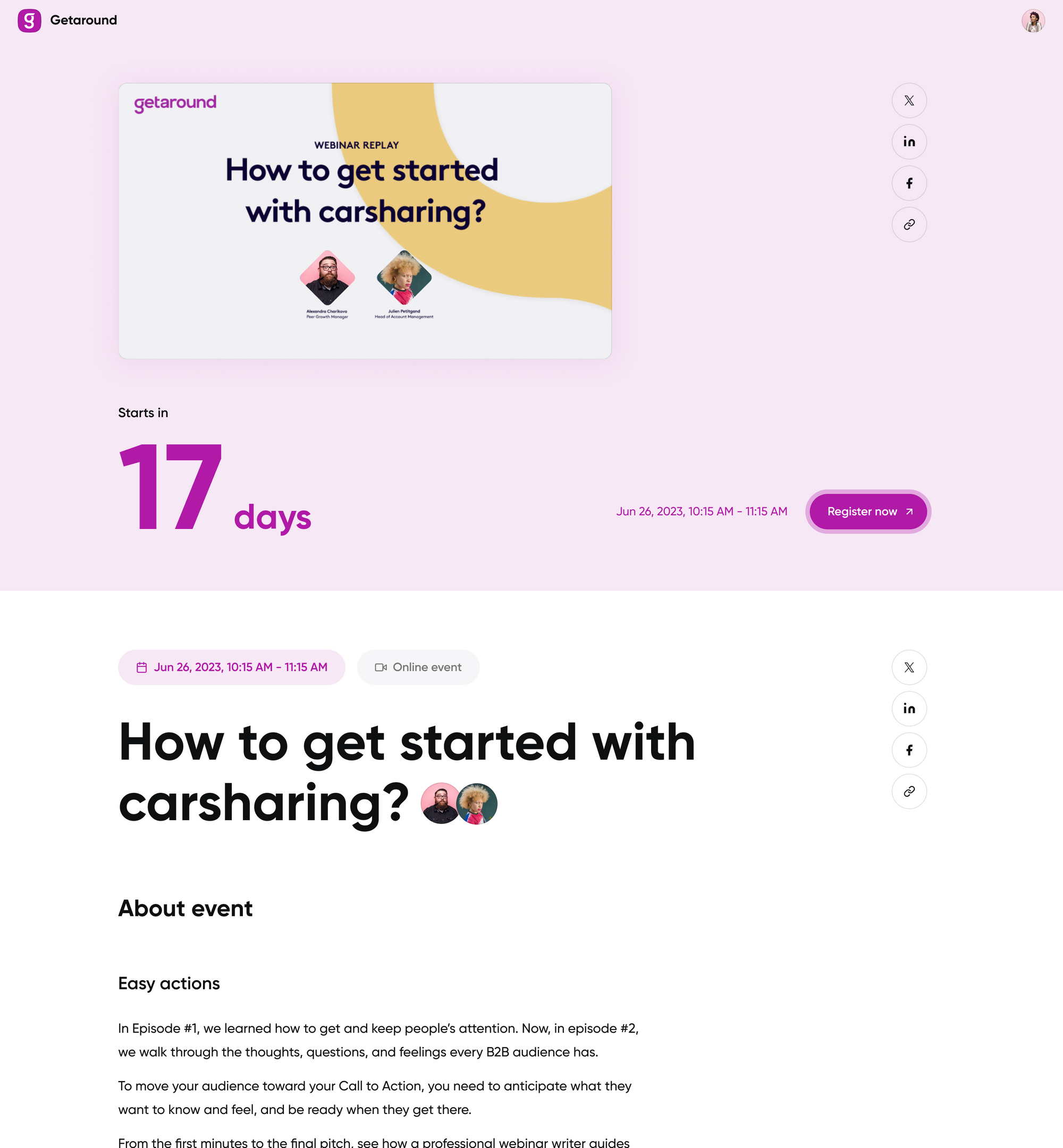
Ok, now the moment is there and your webinar will go live any moment. What does this moment look like? How does it make your viewers feel? Most likely it looks something like this.
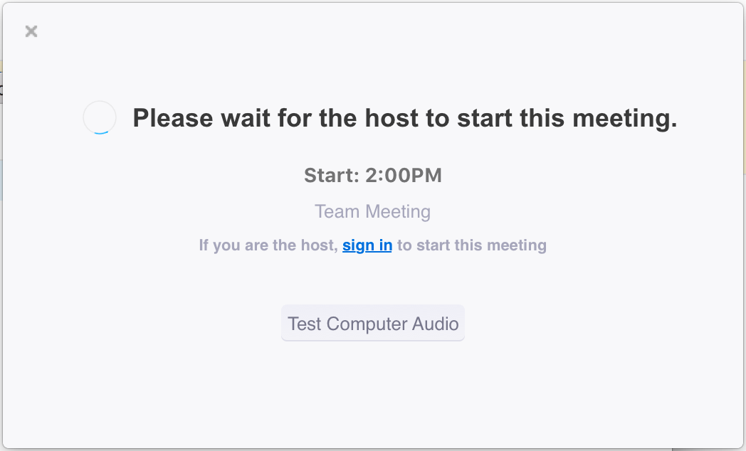
This has nothing to do with your brand. Neither does it make people curious to what's about to happen.
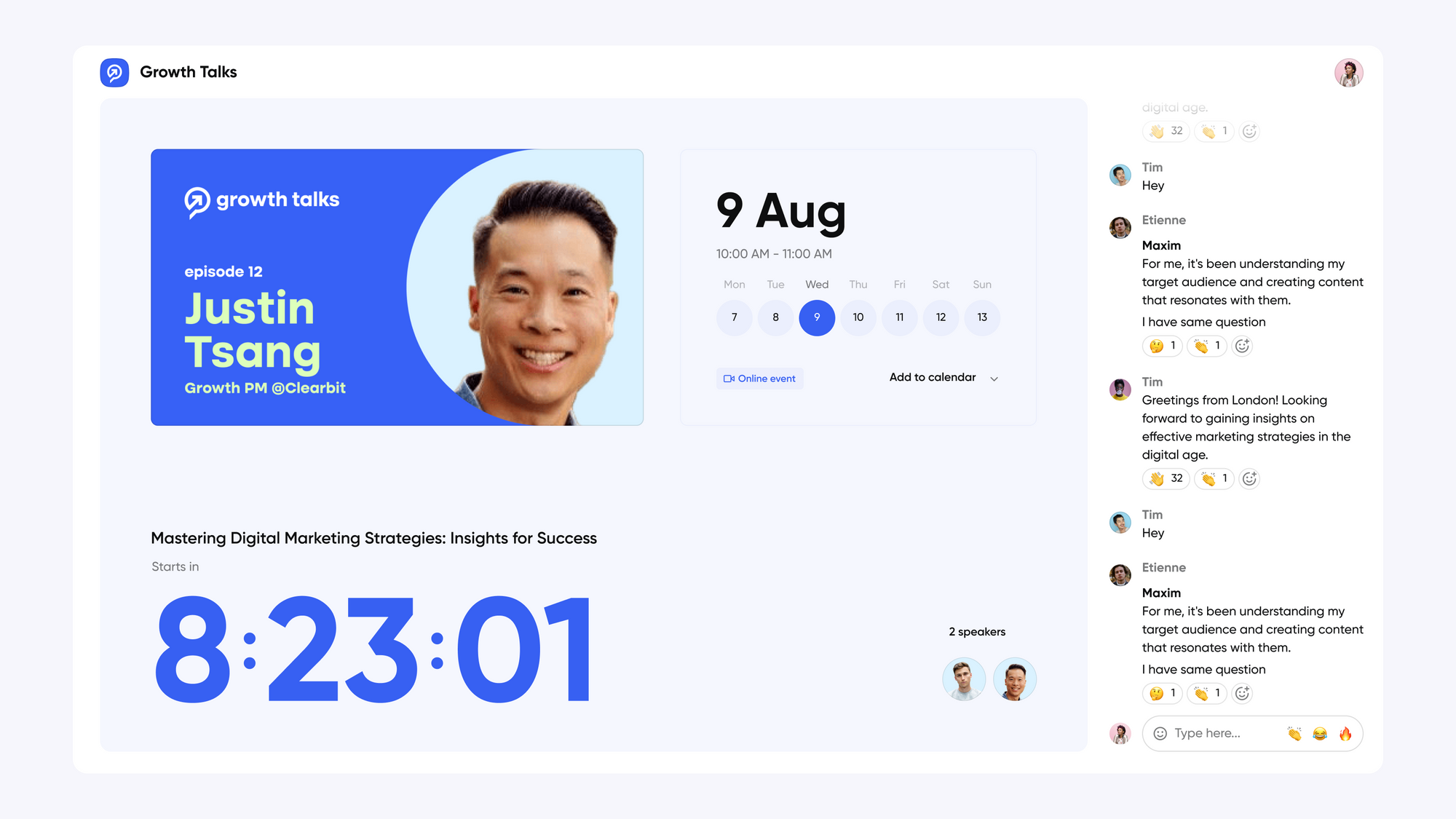
Instead, create excitement by showing your viewers an experience like this. Firstly, it will help them recognize your brand. Remember? This is important to create trust and make sure they stay to watch your webinar. But more importantly, it gets them excited about what's to come. They know that this brand means business.
Conclusion: how to brand your webinar
Alright, in this article we've shown you that branding your webinar does not have to be difficult. On top of that, we hopefully have sparked your imagination on what's possible with a modern webinar platform like Contrast.


Try all of the branding features we've shown you in this article.
Start for free up to 30 registrants. No credit card needed.
Start for free