How to Build a Webinar Registration Page that Converts (Including Detailed Breakdown Example + Free Template)

Done right, successful webinars can generate lots of highly qualified leads for your business. There's a reason 89% of marketers believe webinars outperform other channels in creating qualified leads. So when you find yourself hosting a webinar, you'll have to create a registration page in order to capture those qualified leads.
In this article, we're going to look at what makes a successful registration page. How to set one up. And finally, show you a breakdown and example of a high converting webinar registration page.
What is a webinar registration page?
The webinar registration page, is typically a page on a website that includes information about a webinar and a registration form to capture the registrant's details. The goal of a registration page is to convert a visitor into a registrant.
When we talk about a registration page for webinars, we automatically assume they are gated. That means, the registrants need to fill in a bit of information in order to get access to the webinar.
For most people, this are the email address (preferably their work email!) and their name. From experience, we have seen that it's also pretty normal to ask for more information, such as the company name, job title or telephone number.
The information that the registrant can fill in is usually part of a webinar registration form. This form lives on top of the registration page. The registration page is there to provide extra information that will help the registrant make the decision whether this webinar is interesting for them, or not.
Check out our Complete Webinar Guide — a step-by-step resource on planning, promoting, and delivering high-impact webinars that convert.
The Components of a Great Converting Registration Page
As we said before, the registration page includes elements that help the visitor make a decision whether to register for the webinar. The goal is always to inform, and then convert the visitor into a registrant.
In 90% of cases, a webinar registration page has the same components:
- Webinar thumbnail
- Title of your webinar
- Description
- Call-to-action (CTA)
- Speakers (optional)
We recommend not to steer away too much from this. It's like a landing page. Our brains are wired to scan information quickly, simply because it has been laid out in a predictable pattern. The minute we deviate from this, is the minute the brain has to think too much with the visitor leaving the page as a consequence.
Having this in mind, let's look at what are the most important components and sections of a high converting registration page. Breakdown time.
1. Your Webinar's Thumbnail
What's a webinar thumbnail? Well, it's the image you use to promote your webinar. They often include the title, date and time – and often also the speakers. It's the image that will appear when you for example share (the so-called unfurl) your registration page on LinkedIn. Let's look at how to build a good promotion image for your webinar.
I used to work in advertising, and our mantra was always "faces convert". Not only was it our mantra, it's actual science. That's why we always recommend you to use a cover image and include the speaker's faces. Bonus points if the speaker is someone (somewhat) known in your industry – familiarity helps converting even better.
At a minimum, you should also include the title of your webinar in there. However, as your title will in 90% of cases live right next to the title, we recommend to choose a slight variation of the title. That way image and title will nicely complement each other.
Feel free to add the date and time to your image as well. If your audience is spread over for example Europe and The States, we recommend to include localized times in there. Make it your potential audience as easy as possible: give them the max. number of reason to attend your webinar.
Obviously you will want to design these cover images to match the look and feel of your brand. Not only because it looks more professional – but also because it is proven to improve conversion rates. More on that later.
Here at Contrast, we have built our own template on Figma for webinar cover images. It's easy to simply change the title, faces of the speakers etc.. If you don't have these skills – we recommend checking out the webinar thumbnails on Canva.com
If you have been paying attention to webinar cover images lately, you might have noticed they start to look more and more like YouTube Covers. That's right. What's works on YouTube will also work well for your webinars.
2. The title of your webinar
The title of your webinar is the first signal visitors will pay attention to. It should direct the visitor and give them a general understanding of what the webinar will be about. Its goal is for the user to read further on the page, or of course register directly to the webinar.
Don't forget how quick visitors make their impression. It can be in as little as 50 milliseconds that they have made up their mind about registering to your webinar or not.
We often find that good titles tell the user what they can expect by attending the webinar:
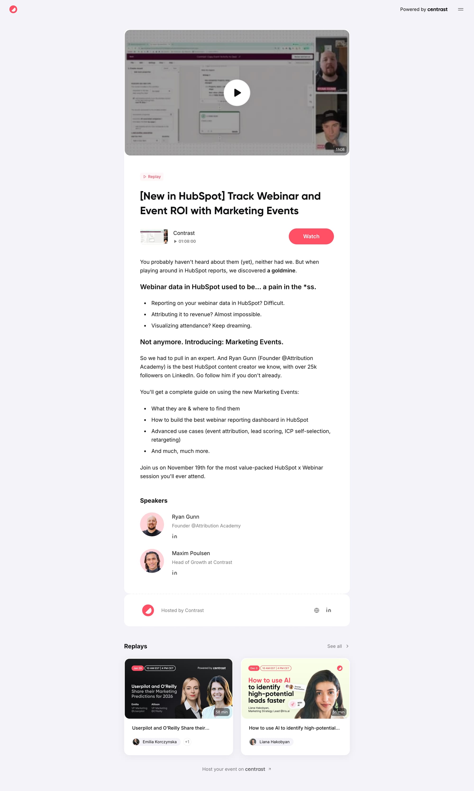
- [New in HubSpot] Track Webinar and Event ROI with Marketing Events
- 45 minutes to fix your startup’s positioning
- Build a Content Engine: Repurposing Strategies for SaaS Teams
And perhaps to create a few webinar titles that are less likely to convert:
- Marketing Events: A Discussion
- Exploring Concepts Related to Your Startup's Positioning
- What is Repurposing and How to do it
You get the point. Writing webinar titles is almost an art on itself. Take these tips into consideration when writing your next webinar title, and we're sure that you'll do a lot better than before:
- Know Your Audience: Tailor your title to your target audience's interests and needs. You can even mention them by name. E.g. Banking Essentials for International Students in Canada.
- Be Specific: Offer to solve a particular problem or issue your customers are facing. E.g. 10x Your eCommerce Workable Leads with Minimal Spend.
- Ask a Question: Questions create curiosity and make people attend the webinar for answers. E.g. What is the Best eCommerce Retention Strategy?
- Use Numbers: Specific numbers boost your credibility and imply measurable benefits. E.g. 10 Secrets on Asana.
- Be relevant: A new legislation that's about to start? People likely have questions about this right now. Give it to them by hosting a webinar.
- Highlight Experts: Mention any experts and celebrities in your field to attract a captive audience. Even include qualifications, if possible. E.g. How To Write Better Requirements - By Jordan Kyriakidis, CEO, ACME Corp.
- Keep It Crisp: Clear and concise language helps users get the gist of what you’re trying to convey. E.g. How PR & Marketing Teams Win in 2023.
- Optimize for SEO: If you want more people to find your webinar on Google, you should use SEO techniques. These include finding the right keyword and using it in your webinar registration page headline.
You can see that many of these tips and tricks involve choosing the correct topic for your webinar. That's right. Having a relevant topic for your audience is one of the most important things to figure out. So important that we wrote another article on just that: Tips to Find Webinar Topics That Engage and Convert
3. Description: the juice of your webinar
In case your title was not enough to get the visitor to register to your webinar, they will now look into the description. The description should inform the user about what is going to be discussed, i.e. the problem – and what kind of outcome they can expect by simply attending the webinar.
We can't stress this enough. People who attend a webinar always expect to get a solution. Sometimes the solution is an answer to a question they had (a new law is coming into place, they want to know how it will affect their business e.g.).
Another time the solution might be a product (a startup is looking to protect their databases, they are looking for a cybersecurity solution e.g.). If you do not offer a solution, chances are that the visitor will think "this can be an interesting hour, but most likely a waste of my time".
In our research we have seen the same pattern that great registration pages are made up of:
Hook and angle to capture the attention of the reader. It usually is a slight change of the webinar title, but in the same vain. It keeps the reader engaged while they move from title to the first sentence of the description. It should give them the feeling "right, this applies to me".
Drive down the problem by further explaining what the problem exactly is, why it applies to them, and most important: why they should solve it. Now you have truly captured the visitor. They realize they have a problem, that it has significant impact – and hopefully with enough urgency that they want to solve it now.
Time to build trust, by explaining why you (and the other speakers) are the right people to help the visitor solve their problem. Here you need to open your toolbox, but proven strategies are:
- The company they work for (HubSpot is trusted more than an unknown CRM)
- Their job title (VP of Marketing vs. assistant marketing manager)
- Concrete results expressed in numbers (40% Increase in traffic thanks to...)
- Testimonials from outside experts
- Etc...
The way you build trust depends on your unique context – and what works within your industry. But the ones above should be a great starting point.
And now... bring it home by once more going over the initial hook and making it clear that the reader can solve their problem simply by attending the webinar. Of course in reality it is more complex than that. But that's not what matters right now. Right now, the only that matters is conversion.
Finish with a strong CTA and tell your viewers to join live and ask their questions. Nothing worse than a webinar with no live engagement.
How you package all of this is entirely up to you. But it's recommend to use bold text to highlight information. You can use bullet points to make it easy for the ready to scan the information on the page.
Other useful information on your registration page
Alright. You have written your webinar's description text. It's flowing – and driving people to your CTA: sign up for this webinar. Don't forget to mention the other, useful and logistical information that will help the visitor:
Speaker Information: Speaker information helps you establish credibility with the attendees. For instance, people attending an SEO webinar are more likely to register if a proven SEO expert is a speaker.
Provide Logistical Details: The boring stuff is as important as the fancy stuff. Basic information like the date, time, duration, and any other relevant details are crucial to keep attendees informed. Make sure to share the timezone of your webinar to help global attendees. Buttons for downloadable calendar events make it easier to improve your turnout.
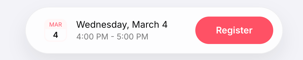
Call to Action (CTA): Use a real button (redirect to registration form) or registration form to capture the visitor's email address, name and other information.
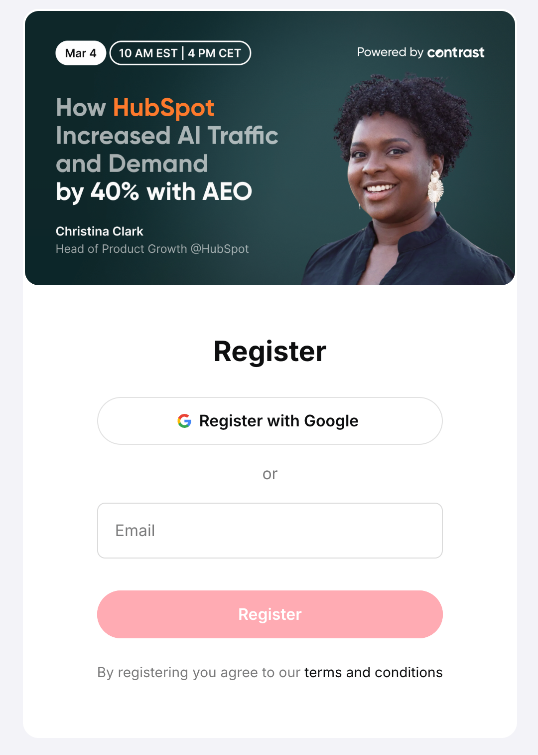
Most webinar platforms help you create automatically registration pages from the information you use when setting up the webinar. You therefore don't need to mention all of this information in the description text as well. For example, here's an example on Contrast:
Speakers
In this section you can give more information about your speakers. Remember that the only role of providing this information is to gain the trust that the speakers are the right people to help the registrant solve their problem. Anything else is noise. We recommend you to always include a profile picture, their role, company and a short description. Do they have an active LinkedIn profile? Include it!
The importance of Brand
A consistent experience is shown to improve conversion rates. That means that if your webinar registration page is part of a larger user journey, it needs to feel like it's part of it – and not stick out like a sore thumb. That means you have two choices:
- Design and host your own registration pages
- Choose a webinar platform with brand features (Contrast e.g.)
If you choose the last option. Make sure that at a minimum you can add your own branded cover image, your company's logo and select the main color or theme of the registration page. Without it, I'm sorry, your registration page will stick out like a sore thumb, ultimately hurting your conversion rates.

Ready to level up your webinar registration pages?
Start for free up to 30 registrants. No credit card needed.
Start for freeDetailed Breakdown of a Successful Registration Page
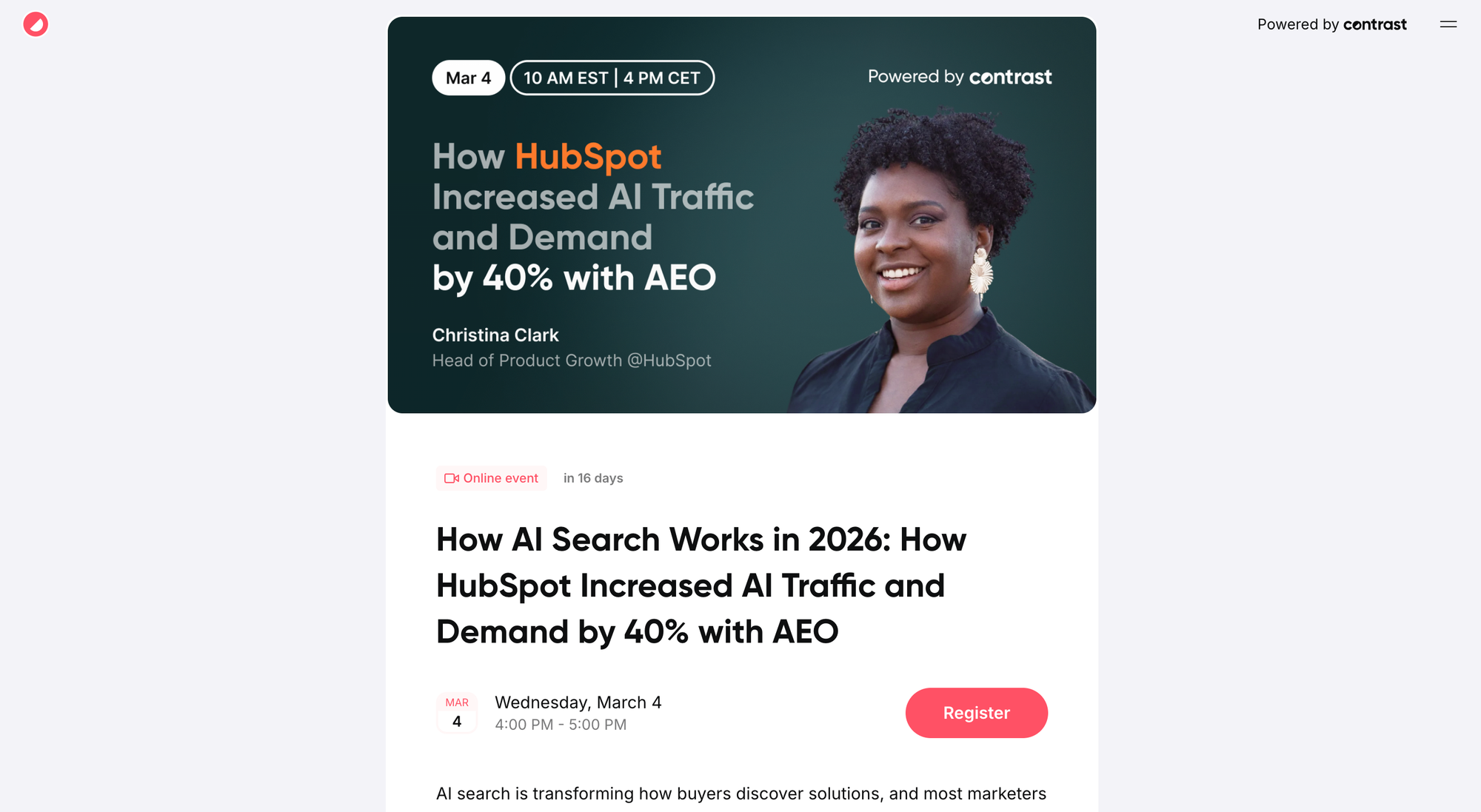
Here's an example from one of our own webinars that we host in partnership with HubSpot. Truth be told, Christina wrote it herself. But it is a great example of a well converting registration page (1000+ signups!). Let's look at the details to understand why it converts so well.
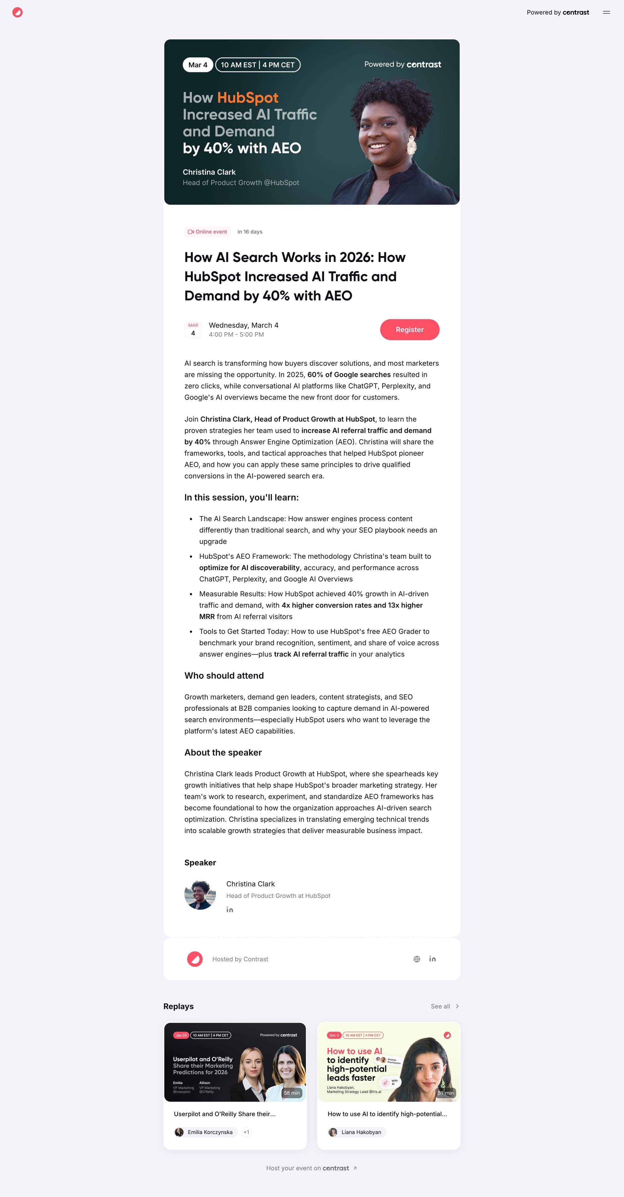
Just the webinar's thumbnail alone is a masterclass in webinar registration pages. Let's look at why that is the case:
- HubSpot called out (look how we put the emphasis using their brand color!)
- Profile picture in large
- Christina's job role is explicitly mentioned
- Strong result in the title (I mean who doesn't want 40% more traffic!?)
- On purpose we left out our own speaker to focus the attention on Christina
- Powered by Contrast (incl. our logo)
You see. That's already so much useful info that goes into the cover image. This is how we need to treat every element of the registration page. Now let's look at the title:
How AI Search Works in 2026: How HubSpot Increased AI Traffic and Demand by 40% with AEO
The title uses the trick of relevancy to full effect in two different ways:
- AI Search is HOT right now (February 2026) – everyone is talking about it
- It mentions 2026 – but we are only in February, this gives the reader the impression there's still time left to implement Christina's strategy this year
There's more to this title though. We mention HubSpot: trust building. There is of course also the result driven trick: 40% more traffic that shows the registrant what they could expect by attending this webinar.
AI search is transforming how buyers discover solutions, and most marketers are missing the opportunity. In 2025, 60% of Google searches resulted in zero clicks, while conversational AI platforms like ChatGPT, Perplexity, and Google's AI overviews became the new front door for customers.
The description starts with laying out the problem into more detail by becoming more specific. It even calls out the person who is most likely to read this: the marketer. More importantly, the description is telling them they are missing the opportunity. And further builds that there exist other ways that this demand is being captured right now.
Imagine you're a marketer reading this. Not only do you now understand you have a problem (AI is transforming the way buyers discover solutions) – you also understand that by tapping into ChatGPT, Perplexity and Google's AI Overviews you can capture that demand. Now you're engaged, looking to learn more.
Join Christina Clark, Head of Product Growth at HubSpot, to learn the proven strategies her team used to increase AI referral traffic and demand by 40% through Answer Engine Optimization (AEO). Christina will share the frameworks, tools, and tactical approaches that helped HubSpot pioneer AEO, and how you can apply these same principles to drive qualified conversions in the AI-powered search era.
Trust building time. We throw in fancy job titles. We again mention HubSpot. Then dive straight into the result people can expect. Again, we're not being vague about the result. Nope, we call out a 40% increase in AI traffic. That's specific.
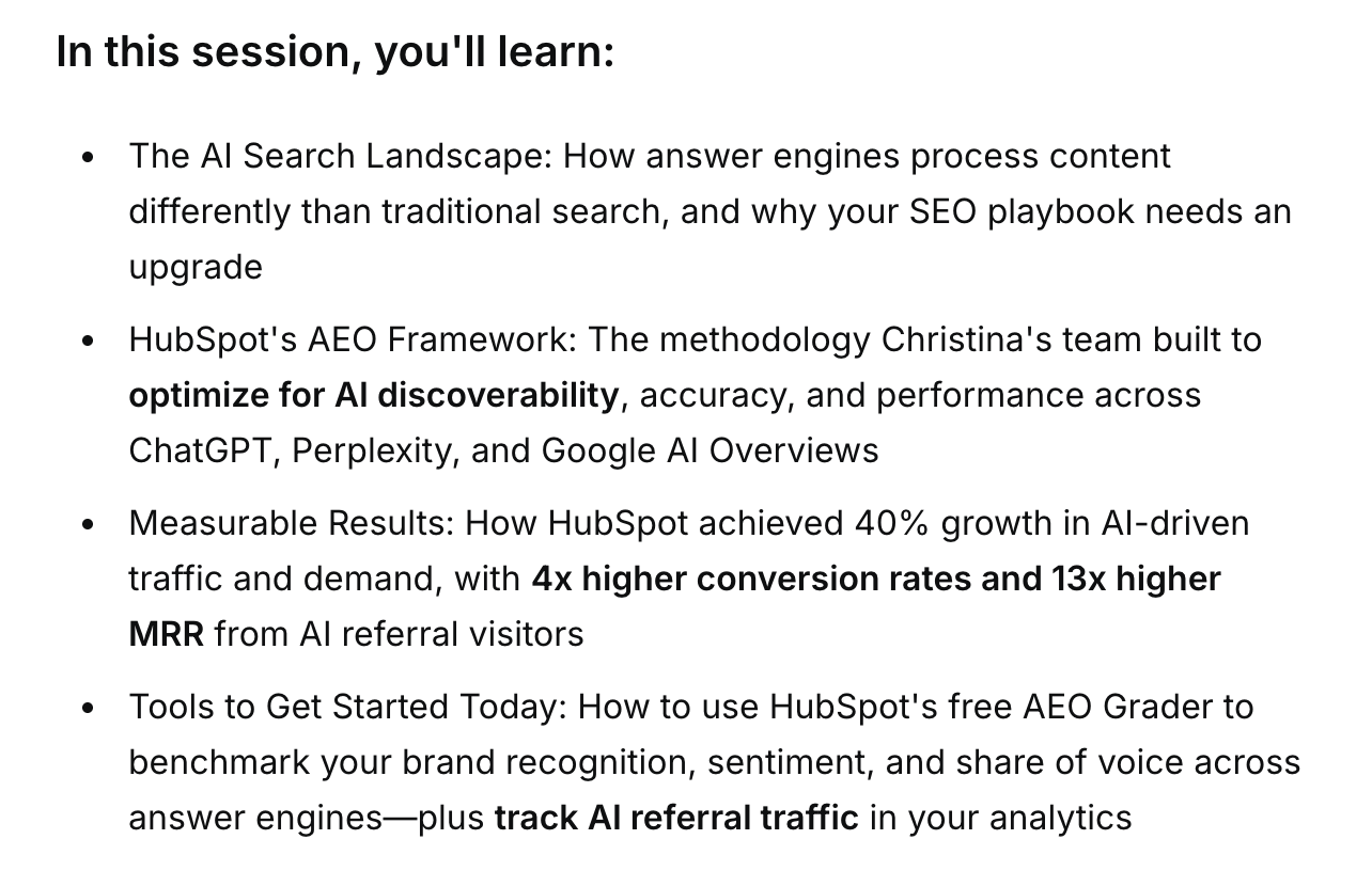
Bring it home. Notice how the bullet points make it easy to scan otherwise quite dense information? It's driving the reader towards action: registering for the webinar.
The reader now understands that they are given the tools to solve their problem simply by scanning the bullet points. Heck, I bet that most readers skip reading it simply because the angle and problem statement were so strong. Let's register already!
Who should attend
Growth marketers, demand gen leaders, content strategists, and SEO professionals at B2B companies looking to capture demand in AI-powered search environments—especially HubSpot users who want to leverage the platform's latest AEO capabilities.
But... heh? More text about who this webinar is for? You already told me this is for marketers. Chances are that the bakery on the corner is not worried about their buyers now finding bread on ChatGPT – if that even makes sense?
That's right. We can easily do without this section. Instead – we should tell the user what action we want them to take: register for the webinar. Let's rework this section a little bit.
Join Christina Clark on March 4 to get the frameworks, examples, and tools you can plug into your strategy right away, before AI search moves even further ahead of your SEO.
Secure your spot now and make AI search your highest-intent demand channel. And not your biggest blindspot.
See how we wrapped it up? Bring back the hook, close it. Attend the webinar. We'll help you solve your problem. That's it. A few more details then...
Important details on this registration page
There's a few. But they're details and you might miss them at first glance. Notice the logo top left? Familiarity. The CTA in Contrast's brand color? Familiarity.
There's also contextual information that will help the reader, such as the date and time – including a little count down "in 16 days" that helps give context to something as abstract as just a date and time.
At the bottom of the page there is more information on the speaker. Notice how it's not a part of the registration page itself? That would possibly distract the reader from the problem > solution trick we built-in. Instead, it's there as a back-up in case the reader wasn't convinced enough yet.
Finally, the page ends with replays from other webinars hosted by Contrast. This is done to show that Contrast has domain authority over a certain topic – by having organized webinars before about a certain topic. In this case the umbrella term is "marketing".
Webinar platforms that help you convert
By choosing the right webinar platform, all of these tricks are already done for you. It's 2026. All of this should be plug and play. So that you can spend all your time creating a great webinar thumbnail, title and description text that helps turn idle page visitors in webinar registrants.
You guessed it. That right webinar platform is Contrast. We're happy to help you get set up in minutes. You can book a demo with Maxim through this link to discover more. Or simply chat about your registration pages.
Webinar Registration Page Template
Use this as a starting point for any webinar registration page.
Replace ALL CAPS placeholders with your own content.
Webinar Thumbnail
Tip: Use faces + logos on the thumbnail. Familiarity converts better than abstract visuals.
Webinar Title
[WEBINAR TITLE]: How to [MAIN OUTCOME] in [TIMEFRAME/CONTEXT]
Webinar Description
[HOOK] Short hook that speaks directly to the main problem and desired outcome.
In this live webinar, you’ll learn how to:
- [BENEFIT 1: specific, outcome-focused]
- [BENEFIT 2: specific, outcome-focused]
- [BENEFIT 3: specific, outcome-focused]
Tip: Phrase bullets as outcomes (“Get…”, “Learn…”, “Stop…”) instead of vague topics (“We’ll talk about…”).
Why This Matters Now
[1–3 short paragraphs where you:]
- Call out the problem and who it affects
- Explain what changed recently (market, tooling, AI, legislation, etc.)
- Make the cost of doing nothing very clear
Example:
AI search is changing how buyers discover solutions. Traditional SEO is no longer enough, and most teams don’t have a clear playbook for capturing this new demand. In this webinar, we’ll show you how to [HIGH-LEVEL SOLUTION] so you can [KEY RESULT].
Tip: Use 1 strong stat or trend if you have it, not a wall of numbers.
Call to action:
👉 [PRIMARY CTA BUTTON TEXT – e.g. “Register for Free”]
Tip: Only ask for the fields you truly use. Extra fields almost always hurt conversion.