Contrast vs. Zoom Webinar - The Ultimate Comparison
Zoom. The video giant. How can it be possible that a small Company like Contrast could possibly create a better webinar product than Zoom? Well, we leave it to you to judge if we're truly better. But we think so, and in this article we'll show you why and what makes us different than Zoom.
Before we do that, let's make clear what the difference is between Zoom Meetings and Zoom Webinar. We'll also explain why we don't recommend using Zoom Meetings as a webinar solution.
What is the difference between Zoom and Zoom Webinar?
There is an important difference between Zoom and Zoom webinars. Zoom Webinars is a different product from Zoom. It's as the name suggests specifically made for webinars and has a different pricing model. You can find more about Zoom Webinars here.
Zoom Webinar is an add-on that you can add to your regular Zoom Meeting plan.
Why we don't recommend using Zoom Meetings for webinars
Zoom Meetings wasn't built to host webinars, but you guessed it.. for meetings. And while it is technically possible to organize a webinar on Zoom Meetings, it's likely going to be a disappointing experience. You'll miss important features like registration pages and CRM integrations. But also during the webinar, you'll find yourself too often asking people to mute their microphones so you can get your story across. And we can leave Zoom-bombing out of this..
Can't I use Zoom Meetings for my webinars at all? Well there is one case where we recommend using Zoom Meetings for your webinars. That is when you only have a handful of registrants that are already familiar with you and your company. This way, you can keep things small and save money.
What are the biggest differences between Contrast and Zoom?
We split this article up into two larger sections. The first is the biggest differences between Contrast and Zoom. Later on you'll find a more in-depth comparison where we discuss the differences across the entire webinar workflow.
Ease of use
Contrast is built for simplicity. It allows you to set up a webinar in a matter of minutes. They automatically generate modern and branded registration pages in return. People that switched from Zoom to Contrast, report that they're about 5x more productive on Contrast. They save, on average, around 4 hours a week managing their webinars. They say it's because Contrast is easier to use, more intuitive, and quicker to learn than Zoom.
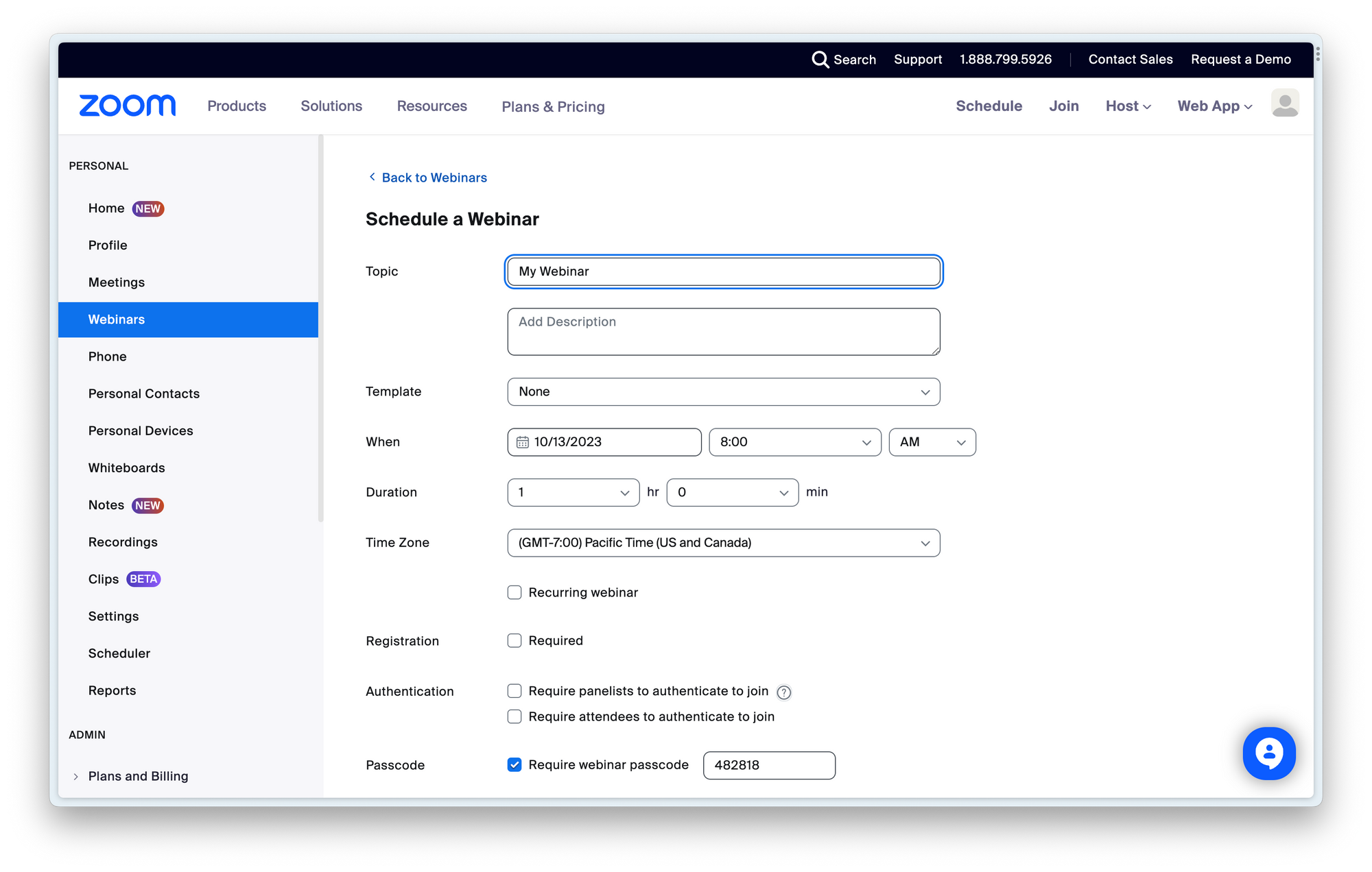
During our review of Zoom, we found ourselves too often having to search simple things like "Where is my webinar recording?" in their help centre. Zoom is simply not as intuitive as Contrast. On the flip side, Zoom has lots of features like password-protected webinars or joining the webinar by calling in from a phone. All these features and checkboxes come at the cost of ease of use.


Try New Way to Run Webinars
Start for free up to 30 registrants. No credit card needed.
Start for freeDownloading software
Alright, Zoom is making changes here. But they are still pushing people to download Zoom on their laptop or phone to watch the webinar. The watch in browser option is too hidden. Now of course, lots of people have Zoom installed already. But it often needs to update, or you need to login again. Frustrating.
All this to say is, it doesn't feel like a very modern experience. In the worst case, people will miss a part of your webinar simply because they are struggling getting into Zoom.
Finally, there's a group of people that refuse to use Zoom, especially since recent backlashes regarding privacy. This will of course hurt the conversion rate of people signing up to your webinar.
Contrary to Zoom, Contrast works in the browser for both desktop and mobile. People do not need to download an app or create an account to watch your webinar. This helps with the conversion rate, and feels a lot more modern.
Video quality
Zoom is famed for its stable video and the audio. But that comes at a cost and that is unfortunately video quality. Zoom Webinars are broadcasted in 480p. What does that mean? If you're not tech-savvy, this screenshot shows what that means.

Most videos that you find on YouTube these days are 1080p (FullHD) – so that is quite the upgrade from Zoom. You'll visually notice the difference. Especially when sharing a slide-deck for example. It'll look very grainy and washed out when it's 480p. Therefore, we don't recommend uploading a Zoom-recording onto YouTube for example.
Does this mean then that Contrast has less stability in video and audio? Nope. Contrast was founded in 2021 and has the luxury of using the latest technologies in video. This way, they can guarantee stable video and audio with high quality video in FullHD.
Webinar studio and engagement
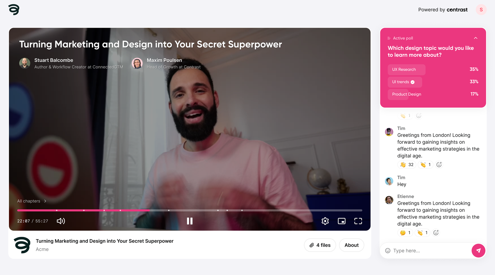
Contrast is the webinar platform that lauds itself to be the most engaging webinar platform. So what does make Contrast the more engaging webinar platform? Let's look at a couple of features that clearly show the differences.
In this video, we also capture the main features of the Contrast webinar studio:
Why do I need a webinar studio?
What's the benefit of having a webinar studio? It's the ease with which you can host your webinar for your viewers and look professional. One of the best features is called the backstage, where people can prepare their webcam, microphone and slide deck. Also if you have multiple speakers, you can decide to leave some people backstage and add others onstage.
Other popular features that we discuss later in this article are layouts, fullscreen animations, and the highly interactive chat. Finally, you can upload slide decks, images, gifs, and even videos to show during your webinar.
Q&A on Contrast
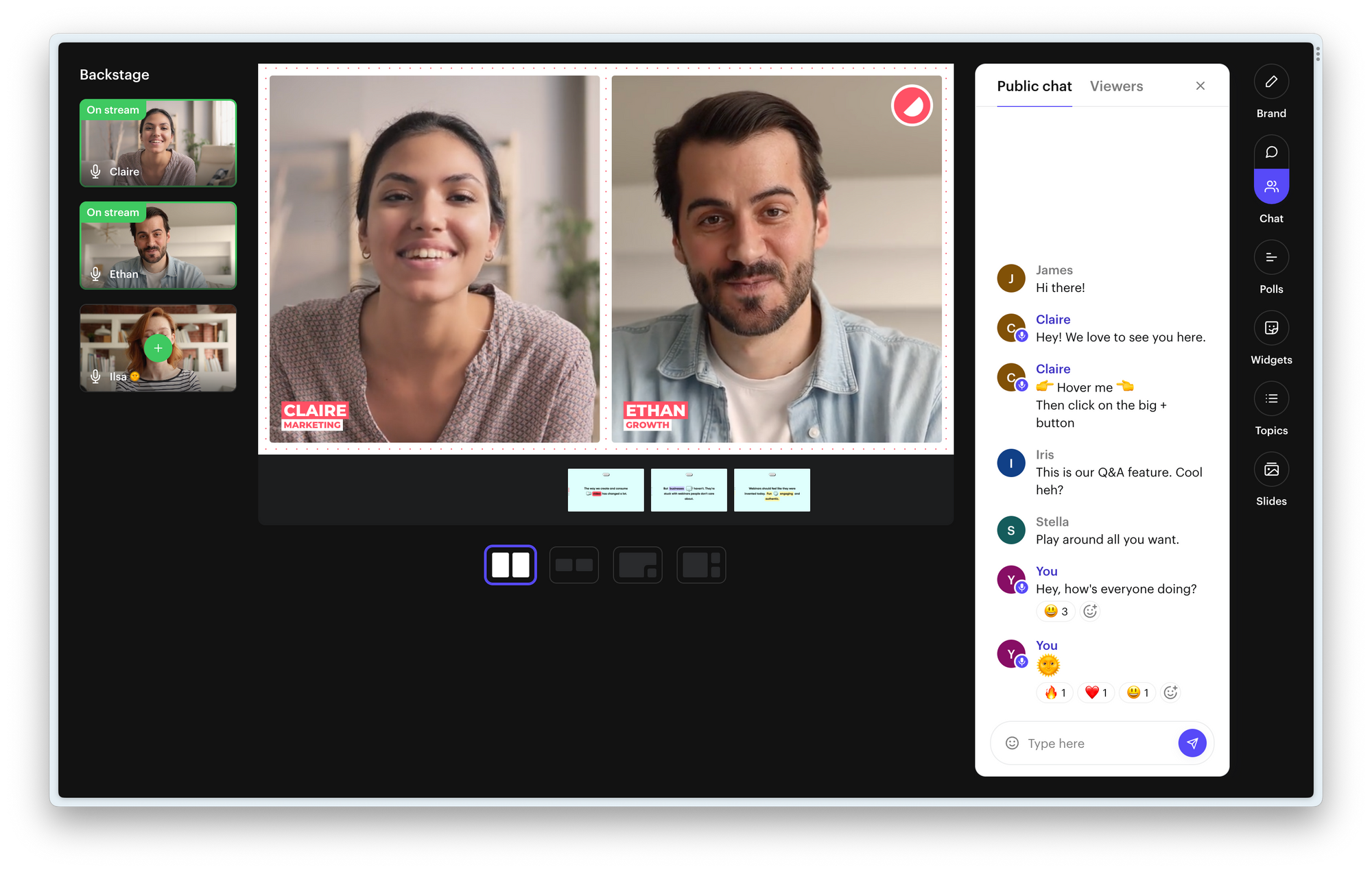
You can add any message or question from the chat onto the webinar's video feed. We call this add onto stream. And you can do this with more things, like poll results or the top trending message from your audience.
It changes the experience completely. Your audience will feel more involved, and participate more during moments like Q&A and Poll. Also, when you decide to upload your webinar somewhere else like YouTube, people still have the full context.
Polls on Contrast
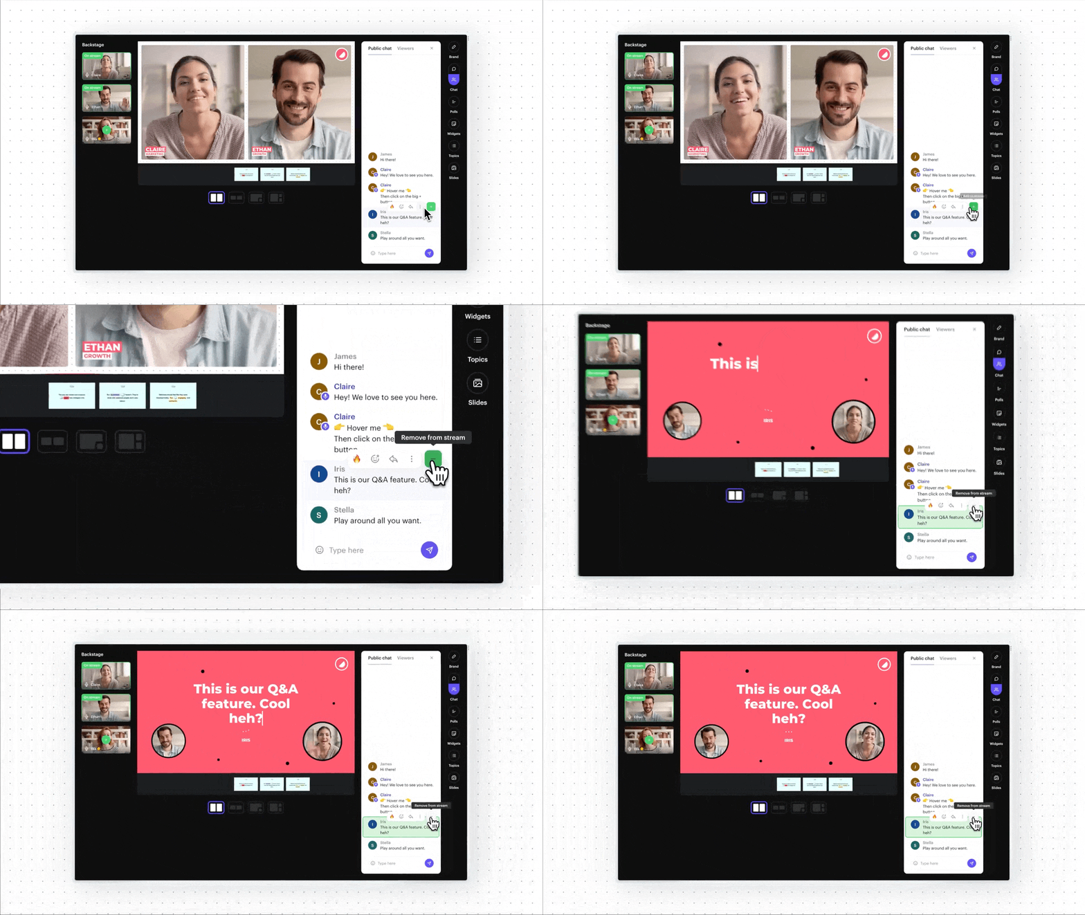
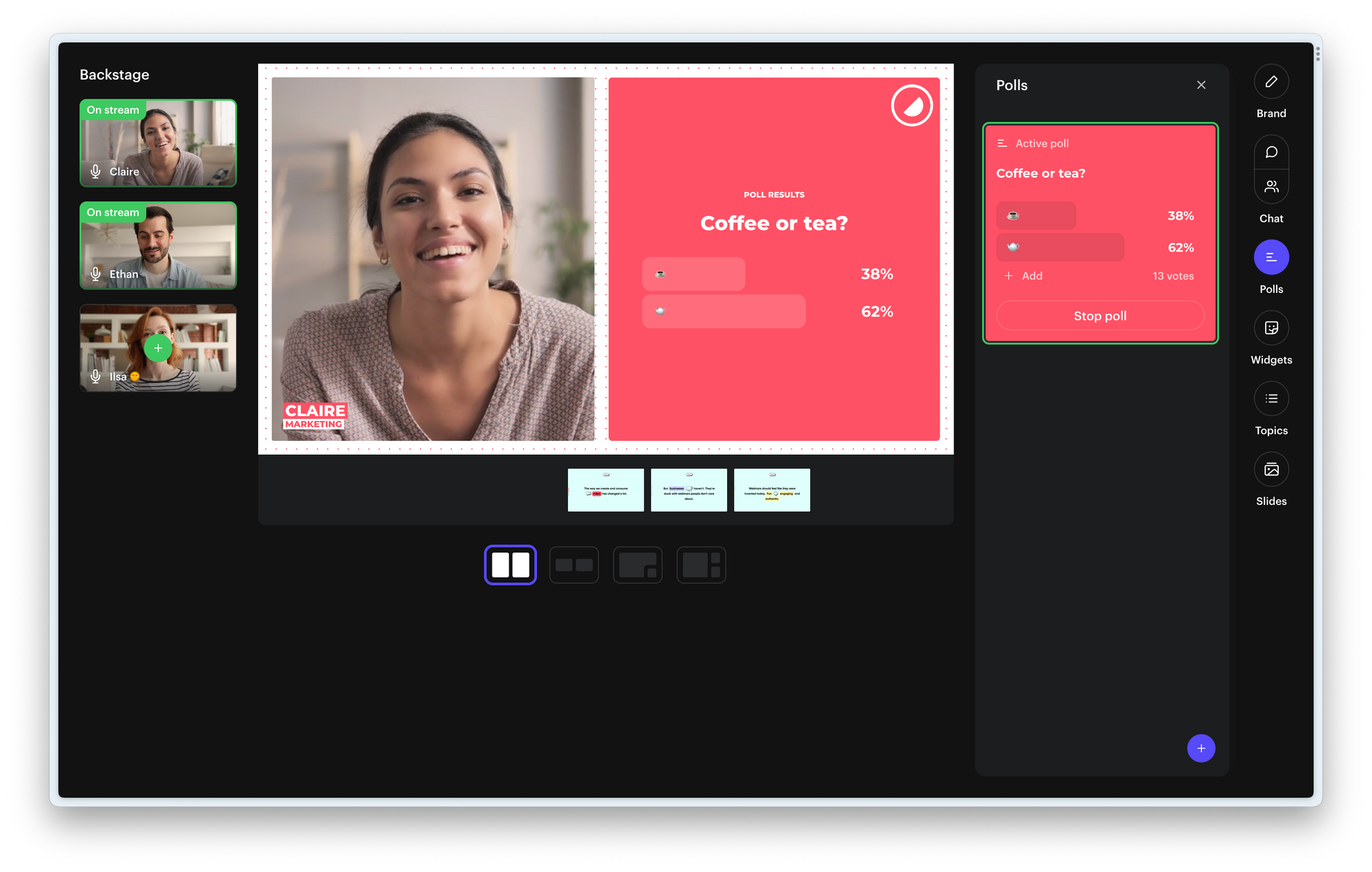
Create a poll directly from the webinar studio. While you're live or beforehand. Add them to the stream to increase participation. The results are updated in real time. Prefer to keep the result to yourself? That's possible too.
Customization and branding
If you're running webinars for your company, you want to make sure your brand is well represented. After all, you spent a lot of time creating your brand.
Therefore it is important that the webinar platform you choose allows you to brand things like the registration page, emails and the video itself. Branding plays a big role in improving conversion rates.
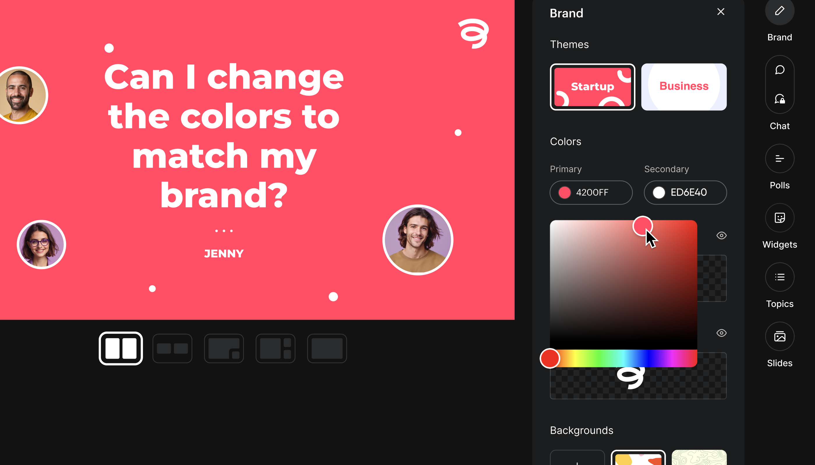
While both platforms offer ways to brand the experience, we think that Contrast has done a better job. They offer lots of branding possibilities throughout your viewer's journey. From registering to the webinar, to the webinar itself. You can upload logos and cover images. You can add your own brand color's, fonts, and backgrounds. It almost feels like a white-labeled webinar experience, but without the costs.
Pricing
At the moment (Q4 2024) Zoom offers their webinar product at a competitive price. For €74,- per month you get 500 registrants. Bear in mind that you also need to have a standard Zoom Meeting license for €14,99 a month. So for about 100 euros you can host a webinar with up to 500 people. If you need more registrants than that, Zoom offers other plans as well.
Zoom is a compelling options for teams that want to host webinars with many registrants. But there is a catch. And that is that Zoom charges based on the number of seats. So larger team will quickly run into extra (unexpected) costs.
Contrast offers a free plan that you can use with up to 30 viewers per month. For a 100 viewers, you'll pay €75,- a month or €60,- when you pay annually. For 250 viewers, the monthly comes down to €188 or €150,- annually. For 600 registrants, it costs €450,- monthly or €360,- yearly. If you need more than that, Contrast offer enterprise pricing as well.
If you're looking for the cheapest webinar platform, we recommend you to use Zoom. But people looking for more branding options, engagement during their webinars and repurposing features should read on and explore why for many teams Contrast is the better option.
Support
Both Contrast and Zoom offer support for their plans. On Zoom, you'll firstly have to talk to a chat bot before being able to talk to a human. On Contrast, you'll directly talk to a human – and the response times are fast. Enterprise customers get a shared Slack-channel with direct access to the technical team of Contrast.
| Features | Contrast | Zoom Webinars |
|---|---|---|
| Works in the browser | ✅ | ❌ |
| Video quality | FullHD | 480p |
| Rich branding and customization | ✅ | ❌ |
| Webinar studio, backstage | ✅ | ❌ |
| Q&A | On-stream | Menu |
| Poll | On-stream | Menu |
| Engagement widgets | ✅ | ❌ |
| Price | Free up to 30 viewers €60 p/m 100 viewers More plans available | No free plan €88,99 p/m 500 viewers More plans available |
| Invite team for free | ✅ | ❌ |
| Support | Human | Bot |
How to make the choice: Contrast or Zoom Webinars
Zoom wins it on price from Contrast. But on all other fronts Contrast is a more complete option to run webinars on. It's the webinar platform that will resonate most with modern companies and startup. The overall look and feel is more modern and they offer a wide suite of branding options. that help you create almost a white-labeled experience for your audience.
The engagement features on Contrast make webinars feel alive and Contrast users report an increase up to 46% in engagement during their webinars. Definitely a plus, in a world where most people don't stick around until the end of your webinar.
Other things like your audience not having to download the Zoom app in order to watch a webinar is a big plus. As well as the FullHD recording that Contrast makes of your webinar. It looks more professional and enables you to repurpose that video later on in shorter clips or on YouTube.
Finally, if support is important to you – Contrast offers fast and human support. For larger customers, they also offer you the ability to have a shared Slack-channel which comes with direct access to their technical team.
If you want to explore more differences between Contrast and Zoom Webinar, we invite you to read on. We break down both platforms across the webinar workflow. From creating a webinar, running it, to analyzing the performance and finally repurposing it.


Try New Way to Run Webinars
Start for free up to 30 registrants. No credit card needed.
Start for freeThe entire webinar workflow Start-to-End
In this section, we'll dive deeper and compare the two webinar platforms on more specific features that we didn't get to before. To make things easy to follow, we have used the webinar workflow as a guideline. So we start by creating the webinar, registration pages etc.. Finally we end up looking at how easy both platforms make it to share the recording of your webinar and repurpose it.
Creating your webinar on Contrast vs. Zoom
Both Contrast and Zoom offer the ability to create a webinar and get a registration page in return. They also both offer registration emails and webinar reminders out of the box. Let's look at the differences here.
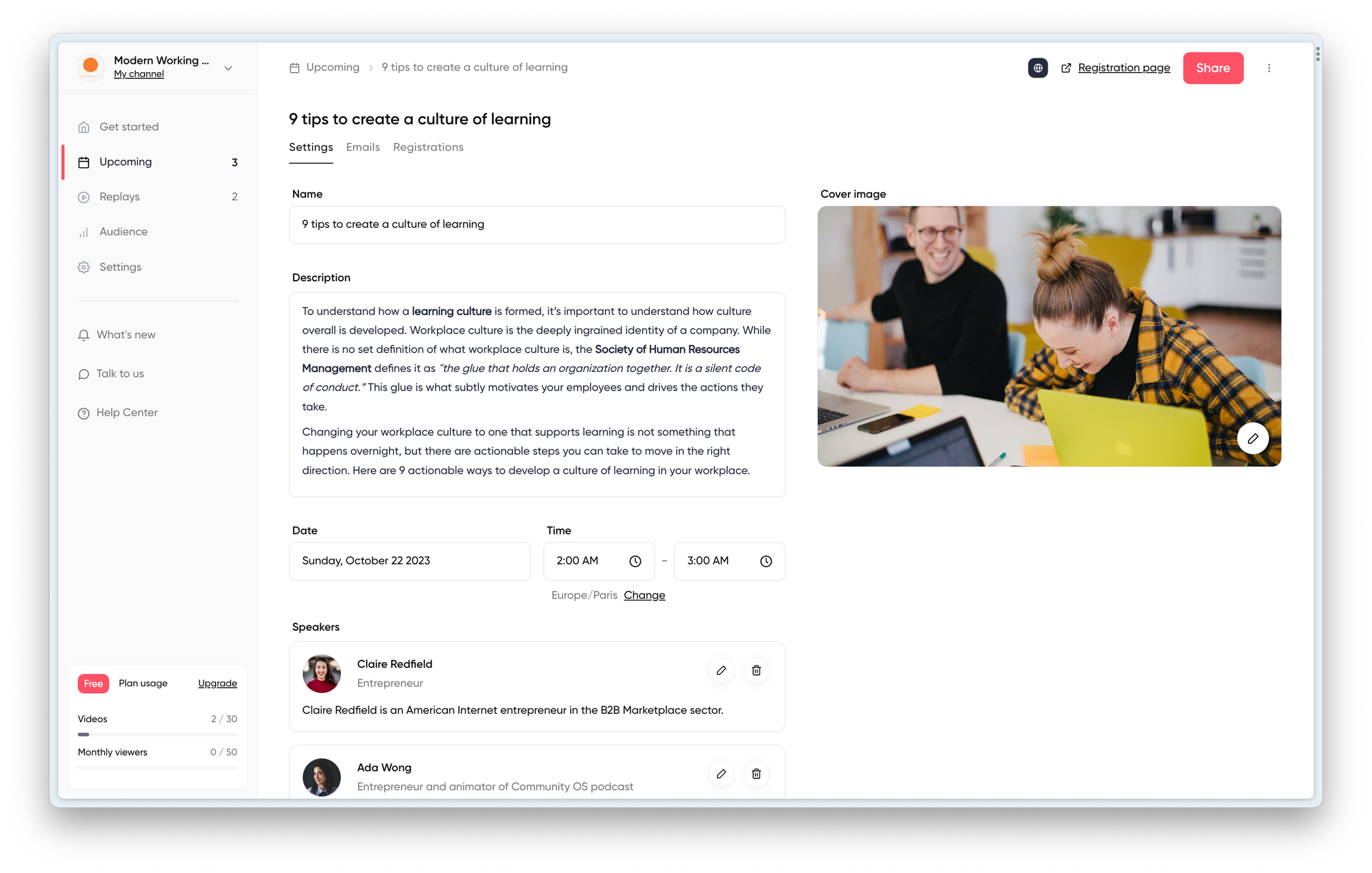
Contrast's UI makes the user experience a lot more simple than Zoom. Within a minute it's possible to have your webinar set up.
The benefit of Zoom though is that they have lots of small features that may be useful to some people. But we think that 90% of people will not need features like a password protected webinar or the ability for people to call in by phone – instead of using internet. Therefore, for the majority of users, Zoom overcomplicates creating a webinar. Whereas Contrast makes it easy and quick to do so.
Comparing the registration page from Contrast and Zoom
The registration page then. Both platforms create a registration page create one after you've filled in the webinar basics. On Zoom this is weirdly another checkbox you've to go through.
But then pay attention to the design of the registration page. For both platforms these a very different.
Contrast
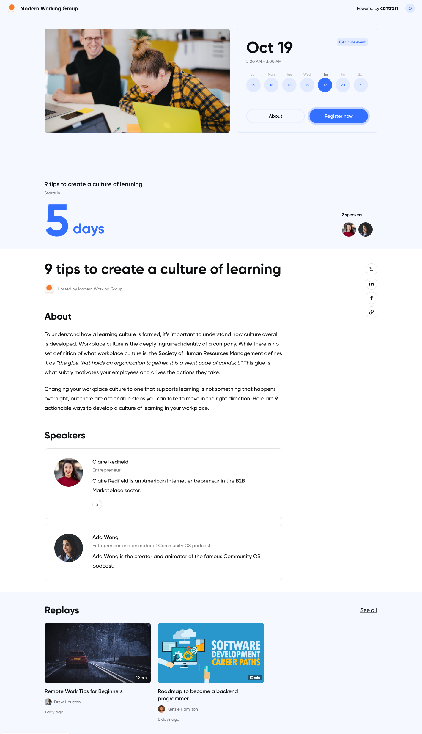
Offers a modern looking registration page that you can fully customize by adding your logo, brand color and a cover image. There is a rich text editor that you can use to really style the registration page the way you want. Think of headers, lists, dividers, images and quotes. It works like Notion.
It shows a countdown timer to help your audience intuitively understand when the webinar is. Instead of having them to calculate it themselves. A nice little detail on the bottom of the page are your previously ran webinars that people can register to in the click on of a button.
Zoom
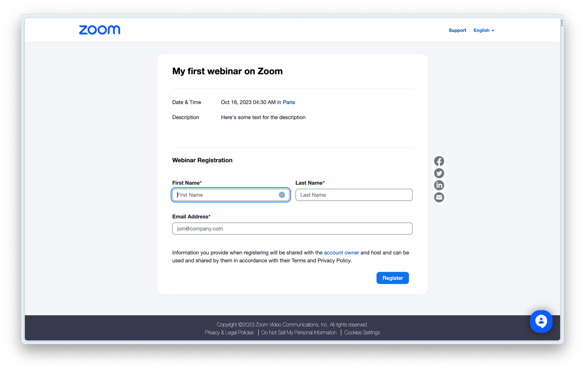
Zoom's registration page is practical, but looks like any other Zoom Webinar. If your brand is important to you, then we think Zoom's registration page lacks customization. It might also hurt your conversion rate down the line.
Setting up emails on Contrast and Zoom
Emails are one of those things you don't want to spend too much time on setting up. Ideally, the webinar platform helps you do this quickly with preconfigured templates and sequences. Like registration pages, you want to put the touch of your brand in there to create familiarity with your viewers.
Contrast
Contrast has pre-configured the most important emails for you in English. They offer you lots of flexibility, including a rich text editor to style the email the way you want. With the editor you can also use variables for things you'll often use such as first_name, event_name, event_date etc.. you catch my drift. Another little feature that will help you save lots of time.
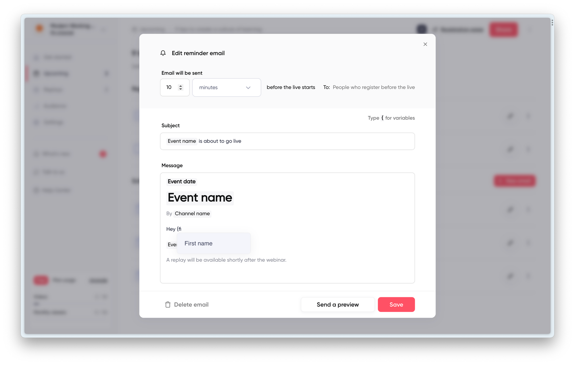
A big benefit from Contrast is that they set the sender to be your email address, instead of theirs. This leads to higher open rates and better trust with your registrants.
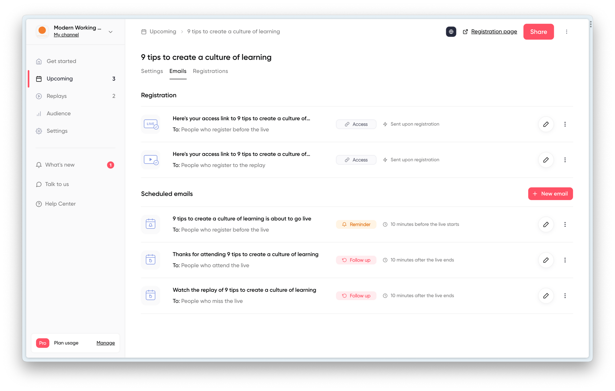
Contrast automatically creates list of people that watched the webinar and that didn't watch the webinar. Each with their own unique email template. Also these you can change. Easy. The only downside is that the email template are only available in English. So you'll need to take a minute or two to translate them into another language if you need that.
Zoom
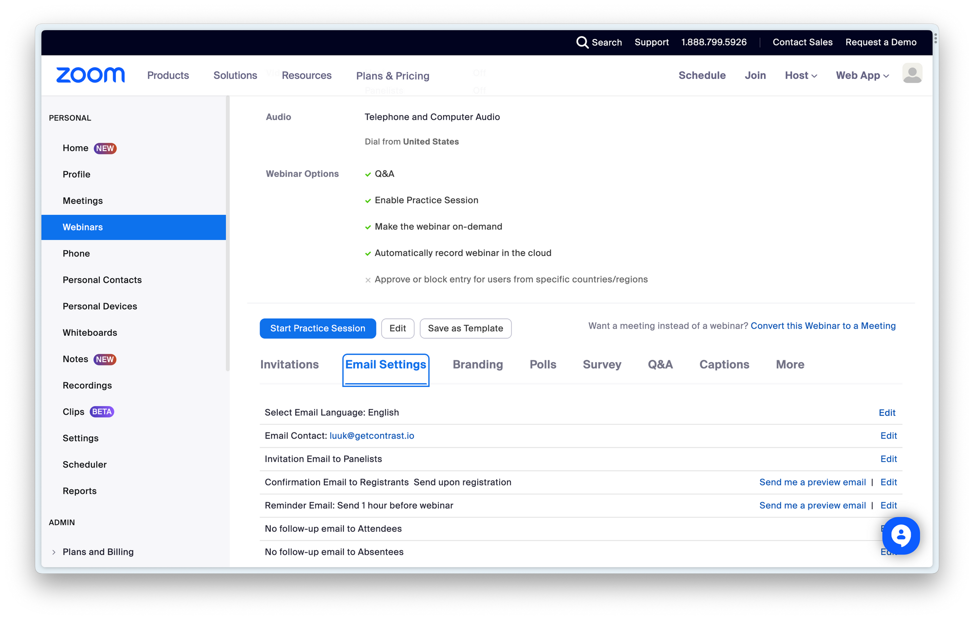
Zoom allows you to configure different emails such as the confirmation email and the reminder. The pre-created templates are clear and will get the job done. The language switcher is a nice detail. The big problem here though is that for a large part you cannot change the copy of the email. It feels generic. Also the emails come from Zoom, whereas we think they should be coming from the company organizing the webinar – as this is what people signed up to.
On the plus side, Zoom offers the templates in multiple languages, which will help you save time.
Running the webinar and the webinar studio
Arguably, this is one of the most important features of your webinar product. The webinar studio and its features ultimately determine how creative you can get and how engaged your viewers will be. Just a PowerPoint with a video feed no longer does in 2023, where people consume content daily on YouTube, Twitch and Instagram.
Contrast
One of the features Contrast-customers appreciate most is the backstage feature. It allows you to have speakers on the backstage, while other speakers are onstage. Speakers that are backstage cannot be seen or heard by others. Super useful for when you have multiple speakers.
Another benefit is that you can set everything up before going live. So that means, add the people onstage that are opening the webinar. Add the slides you want to share. And then click go live.
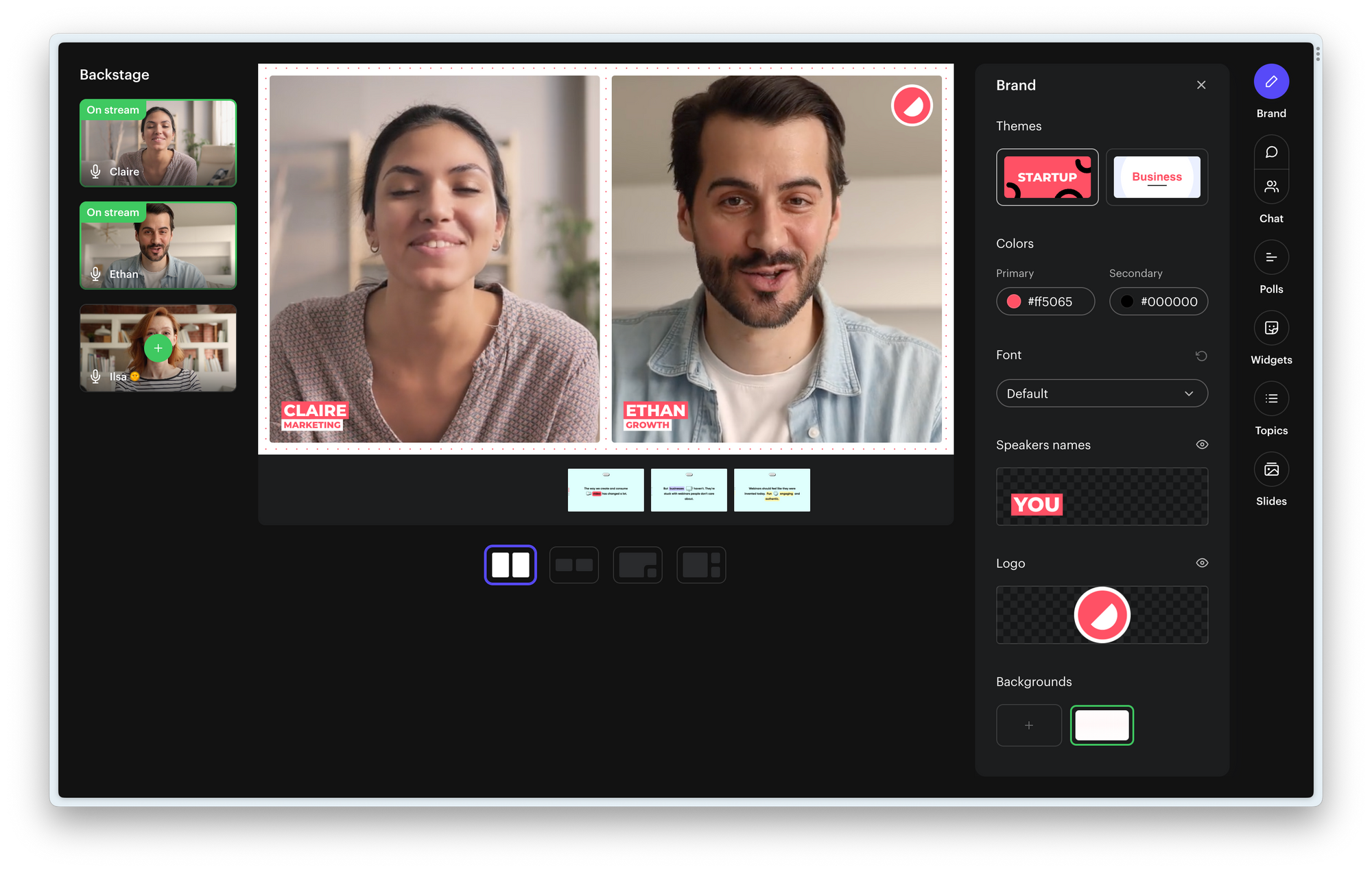
There are also different layout options available to give your webinar a modern look and that better fits what you're presenting. On top of that, you can decide to either share your screen or simply upload your slides. The benefit of slides is that anyone that's a speaker can control slides. So you don't have to share multiple screens or have to ask your colleague all the time "next slide please..".
In the same screenshot above, you can see all the brand features that you can use to improve the look and feel of the video. You can add your logo, colors and fonts. You can also select a theme, one is more modern and the other more traditional. By having it in your webinar, you'll save lots of time in post-production editing if you decide to repurpose your webinar on YouTube or create clips for social media.
We talked about the engagement features before, such as chat, Q&A and Polls. The biggest difference between Contrast and Zoom is that on Contrast these features happen a part of the video. Here's what we mean.

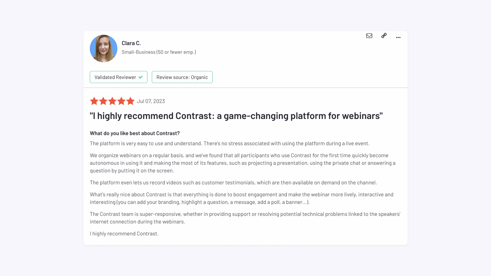
This leads to more engagement and makes the webinar recording more valuable. Customers love these features, as you can see in this review from Clara.
Zoom
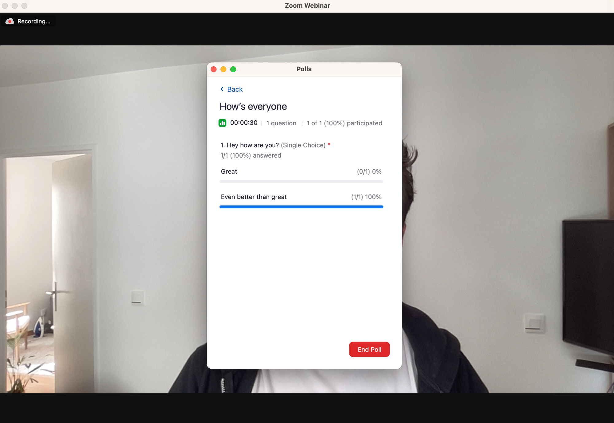
Zoom has most of the feature you expect such as Q&A and Polls. They're straightforward enough, but often a bit clunky in use. Here for example, we have the Q&A feature from Zoom. It requires several clicks and in menus to get here. Whereas on Contrast, you simply ask your question in the chat for it to enter the Q&A feed.
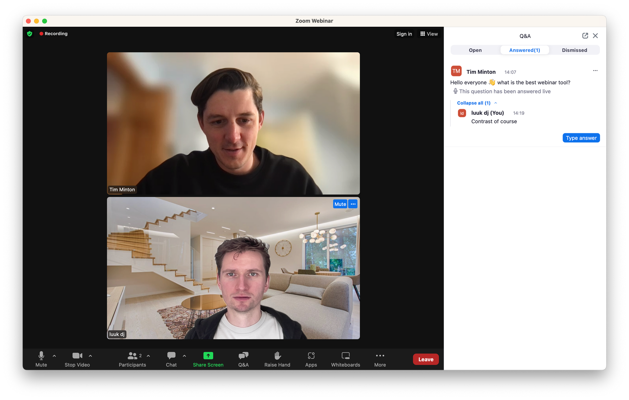
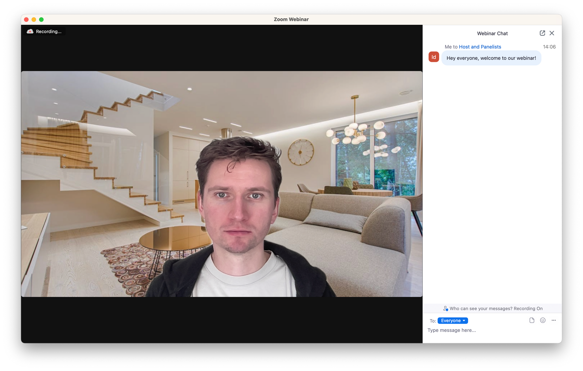
Zoom's features work. But after having seen what's possible on Contrast – do you really want to host webinars that look like this?
Analyzing webinar success on Contrast and Zoom
Now that your webinar is over, you're likely interested in understand how it performed. Did people watch the webinar until the end, did they engage? These are all questions you want answered. Ideally, your webinar platform also sends this to your CRM so your sales team can personalize their outreach.
Contrast
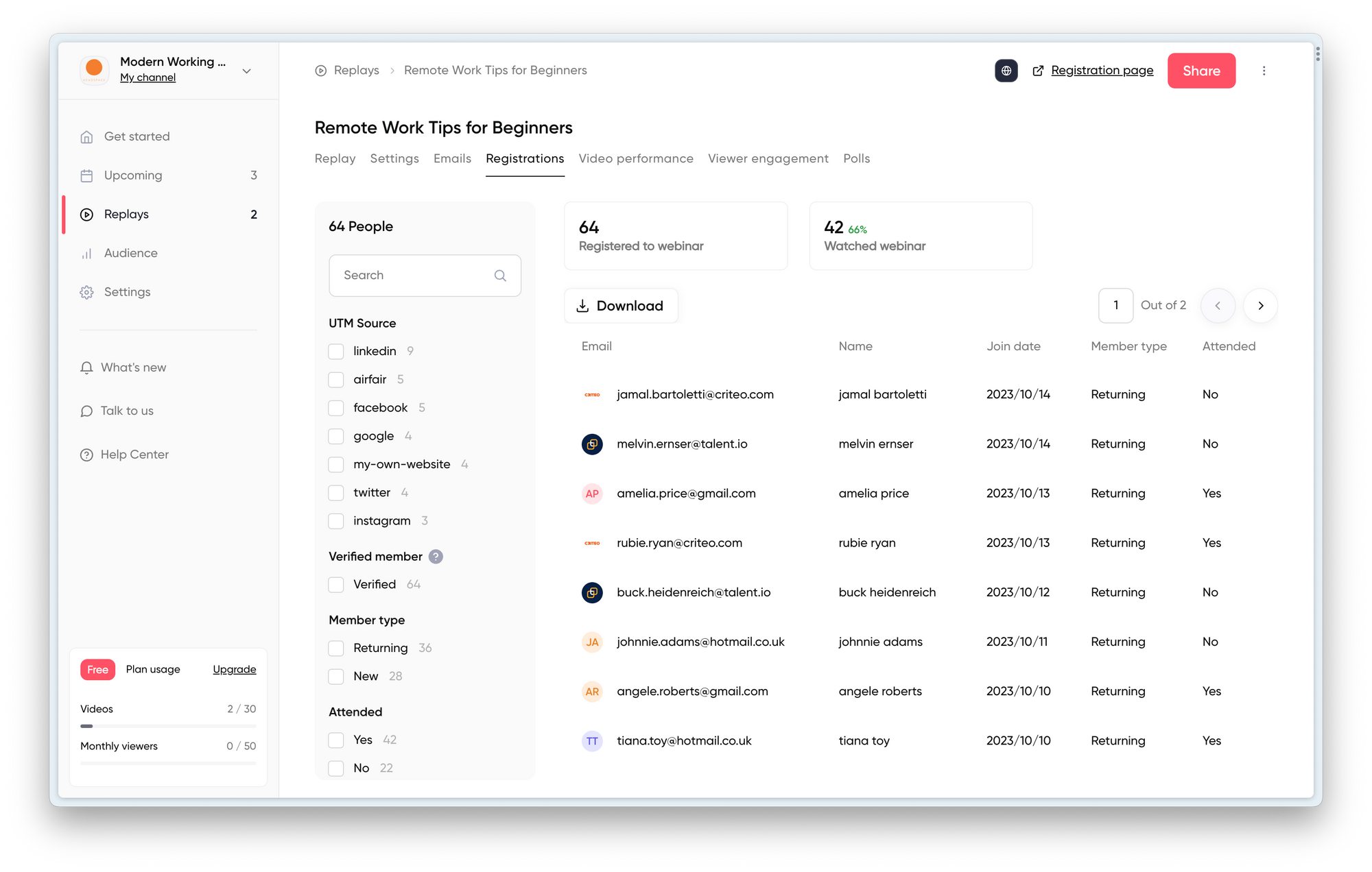
Contrast makes it easy to understand who registered to your webinar. Lots of filtering options help you better understand how your registration pages and marketing campaigns (UTMs, Referrers) are performing. Of course you can download this data into a .CSV but also send it in real-time to your CRM. We'll discuss CRM integrations later on.
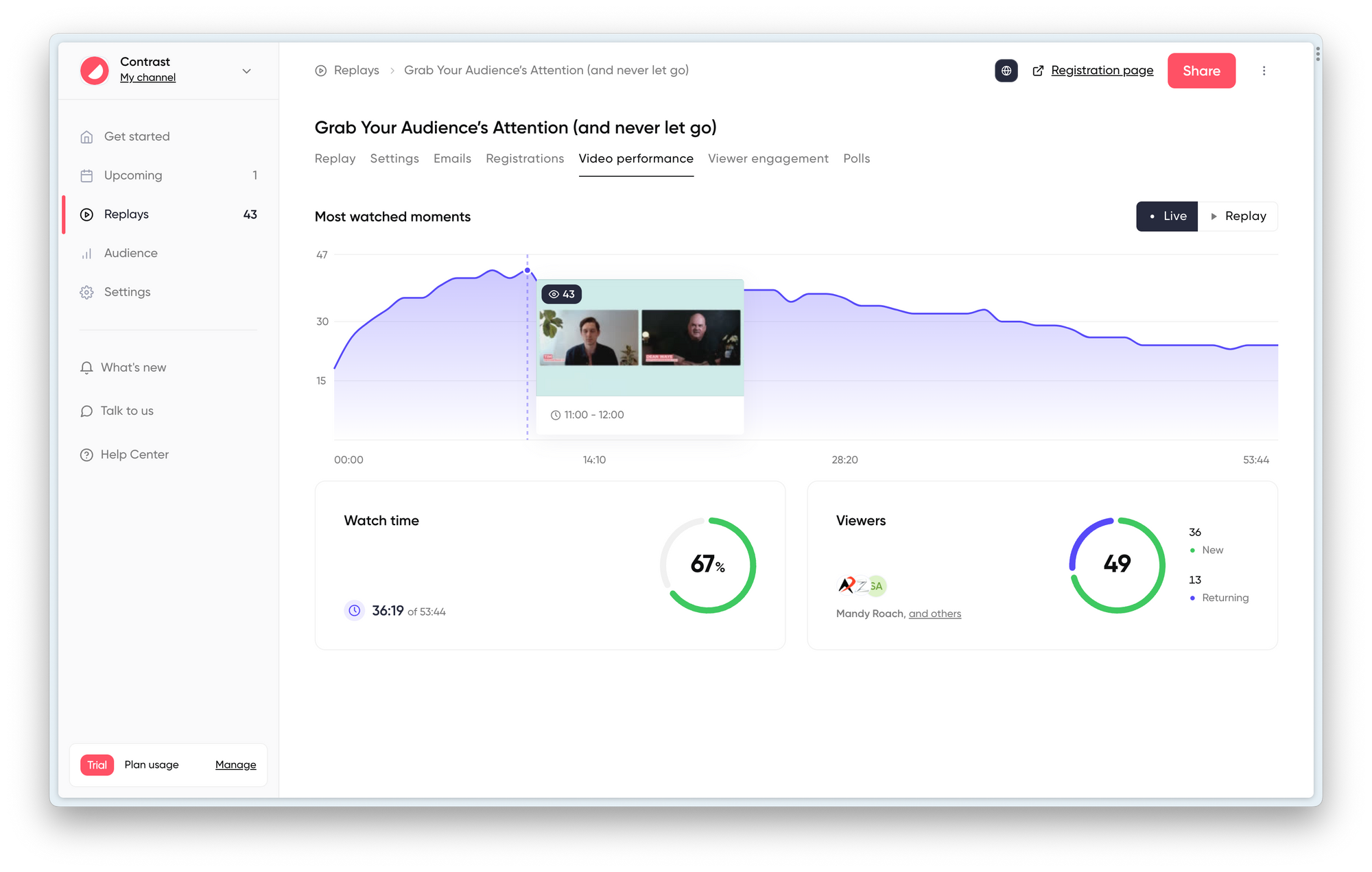
After the webinar is over, Contrast also offers loads of analytics and graphs to help you understand how your webinar performed. People with their own YouTube channel will know, this is where Contrast took their inspiration from for their analytics dashboard. But after using it, you'll probably agree that was a great decision.
Contrast perfectly shows you how many people watched at what point in time. It also sums up your average watch time of the webinar in total. This helps you compare webinar against one another. Of course, the higher the watch time the better it is. As you can see, you can get the data for both the live webinar, as well as the replay. Did you know that in 2023, 55% of people watch a webinar on replay?
You can get a similar breakdown but then per viewer as well. You can use this to understand how engaged a certain prospect was during the webinar. Did you run a poll? You can easily find back the results, share them with your team and even understand which person answered what poll and see what their answer was.
Zoom
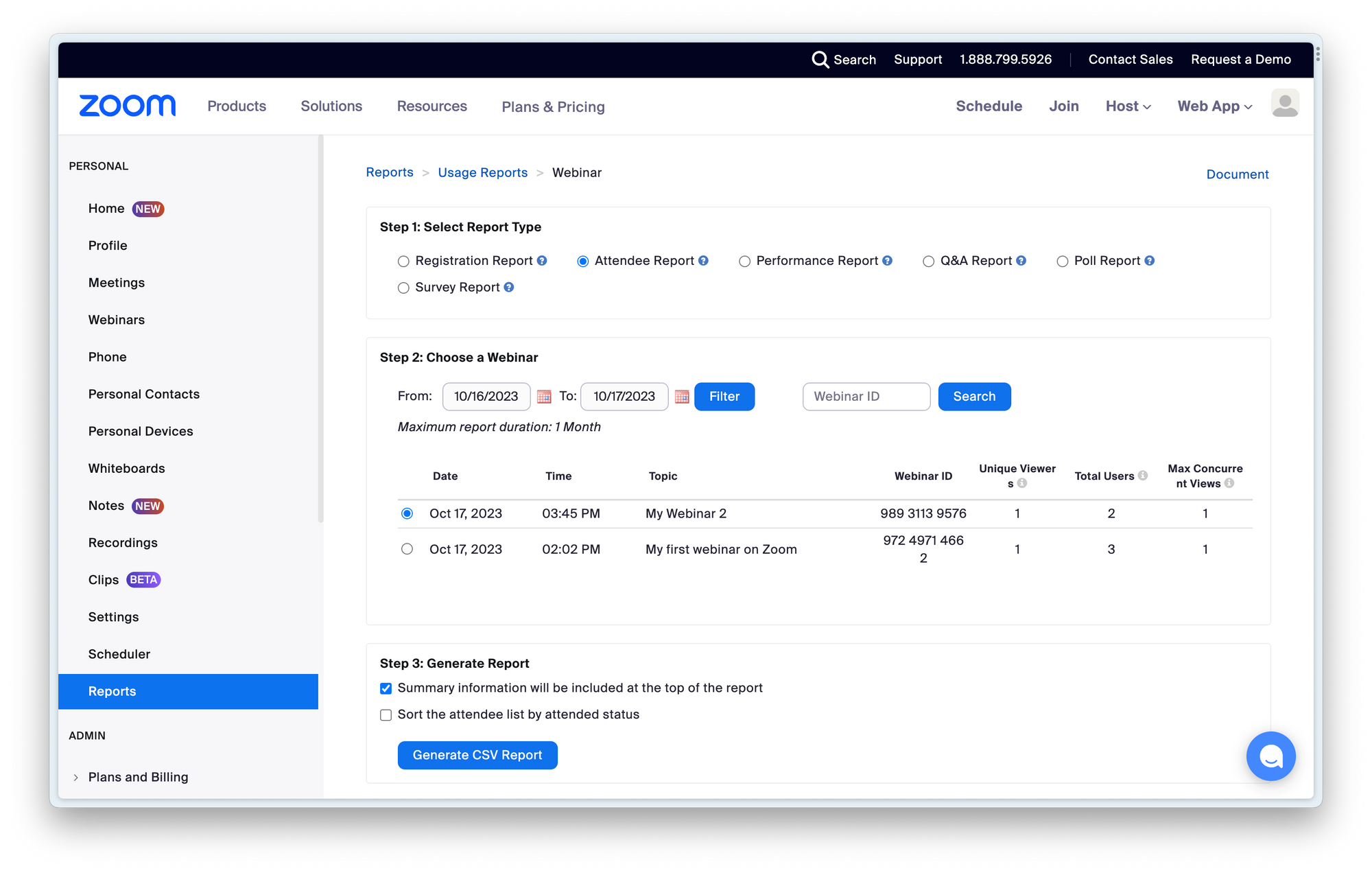
This is one of the features Zoom lacks most in. Simply because for every thing you want to understand about the performance of your webinar, requires you to create a new report. Yes, the data is there. But why does it not auto-generate this date for you? Every self-respecting webinar host uses this data daily to create better webinars.
The biggest problem of these reports is that they're CSV exports. So you still need to do all the analysis yourself. Nobody has time for this.
CRM Integrations
Chances are that you're running webinars to generate leads or interact with your customers. If that's the case, you should look for webinar platforms that integrate with your CRM. Without it you'll be downloading and uploading CSV-files between your webinar platform and CRM all the time.
So let's look at which CRM integrations of both products and how people review them.
Contrast
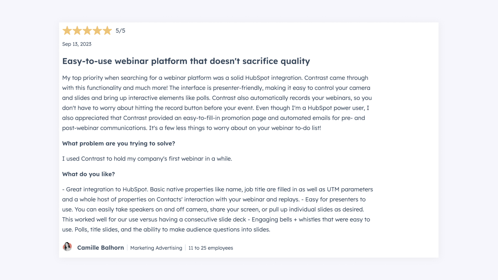
At this moment, Contrast has a HubSpot integration that is very well reviewed in the HubSpot Marketplace. The current rating is 4.9 out of 5.
Don't worry if you're not using HubSpot. Contrast connects to 3000+ tools with either the Contrast integration for Zapier. Or the Contrast integration for Salesforce & Make.
Zoom
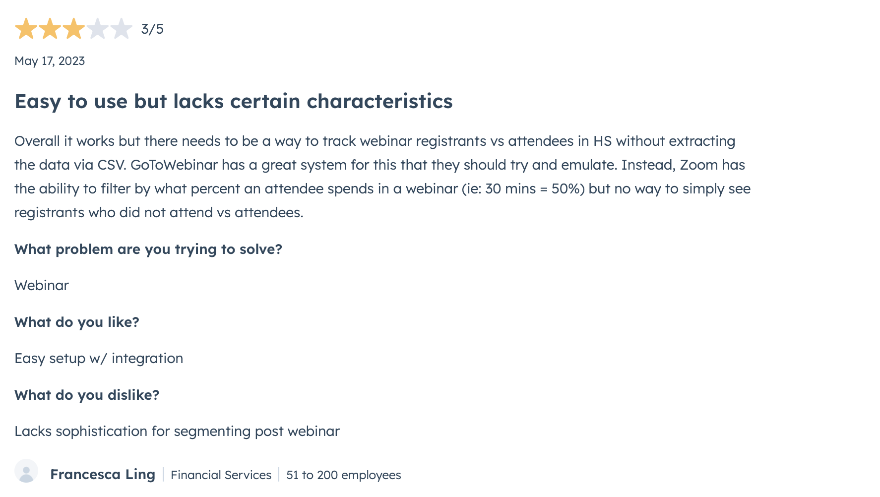
Zoom also has a HubSpot integration, however its score in the HubSpot Marketplace is a lot lower than that of Contrast. Just 3.4* stars.
Next to HubSpot, Zoom offers CRM integrations for Salesforce, Marketo and other CRMs. There's a full list available of all the integrations Zoom has on their website.
Getting more value from your webinar
How easy is it to promote your replay? How do you repurpose your webinar in clips, or maybe a blog article? Let's dive right in.
Create a replay or recording from your webinar
Contrast
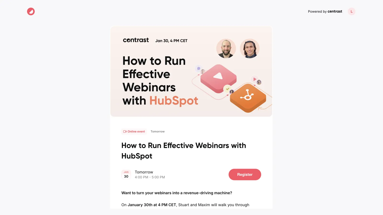
After the webinar is over, Contrast automatically generates a replay from the webinar. This replay is available on the same link as the live webinar, with its own registration page. This way, your audience that already registered can watch the replay – without you having to do any work. Combine that with the email sequence that goes out for people that registered to your webinar but did not watch it live, and you can simply sit back and relax.
Zoom
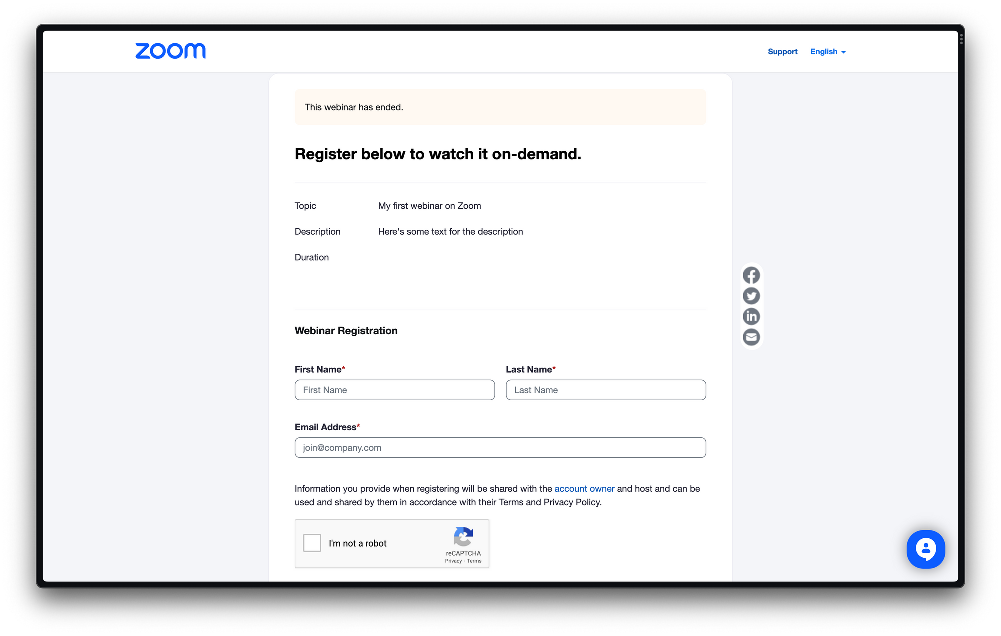
Zoom makes it unnecessarily difficult to manage your replay. First of all, you need to mark that you want the webinar to be recorded. Not a big problem, but still annoying. Now you need to decide if you want to record it locally or in the cloud. Another decision. And how do I know what's best?
If you recorded in the cloud, you're lucky because Zoom will now send you an email with a link to your recording. You can use this as a registration page for your webinar. So everything is possible. It's just not easy.
Create clips from your webinar
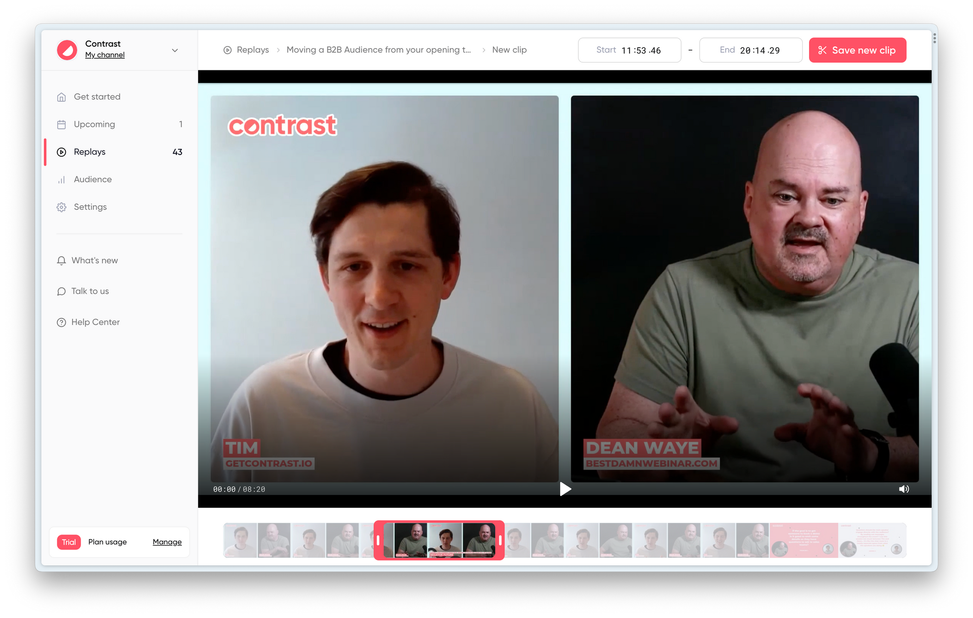
Contrast creates clips automatically from Topics you created in the webinar studio. If you want, you can also manually create clips from the best moments of your webinar.
You can also clip on Zoom. Go to your recording. Play the recording and look for the scissor icon.
Get the transcript from your webinar
Use your webinar transcript to create a blog article, it will save you a lot of time. Contrast makes this easy with their download transcript feature. You could then use ChatGPT to turn that transcript into a blog article.
Zoom also offers transcripts as a downloadable.
Embed your webinar
Contrast makes it incredibly easy to embed the recording on for example your blog or resources tab on your website. Simply copy the embed code, and your webinar is live! So easy that there's no excuse not to do it. Here's what the Contrast embed looks like:
Zoom allows you to embed through their Meeting SDK. This will require time from a developer to set up.
Concluding the ultimate Contrast vs. Zoom comparison
Zoom is difficult to use, a lack of branding but cheap
Where do we start? Zoom is cheap. We give you that. It becomes more expensive when you're working with a team. But still affordable. It has most of the features you expect a webinar platform to have. So is it the best choice? It depends. But if you're a modern company or startup – we think it's not.
Zoom feels outdated in 2023. Most of our days we spend on YouTube, Netflix and apps like Instagram. Modern apps that are easy to use. Zoom is not that. During our review, we found ourselves way too often having to read upon the help articles from Zoom. Even for simple questions like "How do I start the webinar?" we had to look up.Zoom is difficult to use. You've to search in a lot of menus. A lot of menus.. and even then it's not guaranteed you will find what you're looking for.
Can you imagine how your viewers must feel? Right. If they have to struggle to sign up to your webinar, or participate in the chat. It's inevitably going to hurt your bottom-line. One way or another.
That's not to say Zoom is a bad webinar platform. It's not. It's just difficult in use. But if you're looking for a webinar platform that has all the bells and whistles, such as password protecting your webinar platform. And you have lots of patience, you're likely going to be happy with Zoom. Or simply if you're budget constraint.
Contrast the modern Zoom alternative – and more
If you don't have any of those constraints. Then we recommend using Contrast as your webinar platform. Yes, it will be a little more pricey. But you will easily earn this back by the time you save hosting your webinar.
Contrast is easy to use. Setting up a webinar is a matter of minutes. In return you get fully branded registration pages that look modern and are built to improve conversion. It offers all the data you need to understand how your webinars are performing and how engaged your audience is.
Their webinar studio looks and feels modern, allowing you to impress your audience. You can easily invite other speakers, without them needing a license. Interaction features, such as Polls and Q&A on stream help you increase your participation rates. And ensure that your audience will watch until the end.
The branding features in the studio help create a video that looks modern and on-brand. Saving you lots of time editing the webinar afterwards. And because your webinar is recorded in FullHD, you can easily reuse the video on YouTube or social media.
With repurposing tools like Clips, Transcripts and Embed you'll ensure that your webinars continue to live on after they're over. Helping you to generate value from them long after.


Try New Way to Run Webinars
Start for free up to 30 registrants. No credit card needed.
Start for free