New: Branded Webinars

Watch the announcement video
How can we create an experience that feels authentic to your brand?
This was the question we asked ourselves this summer.
We always felt that our brand was standing in the way of your brand. It just didn't feel natural.
People feel a certain way when they see your brand. You worked hard at creating that feeling.
And it is exactly that feeling that got lost as soon as your viewers went to Contrast.
This is common for all webinar products. Unless they're white-labeled and you're ready to pay €20k a year, choosing the right webinar platform often means balancing brand control, flexibility, and cost.
We set the goal to create an experience that comes close to something white-labeled.
We wanted to make sure your viewers feel right at home on Contrast.
Things like registration pages and the webinar should look and feel like your brand, not ours.
It should be so simple to use that you only need your brand's primary color and not a design degree.
And we don't see why you should pay more to show your brand. So we made it free on every single plan.
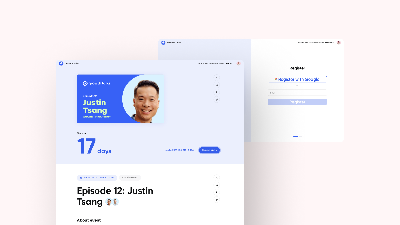
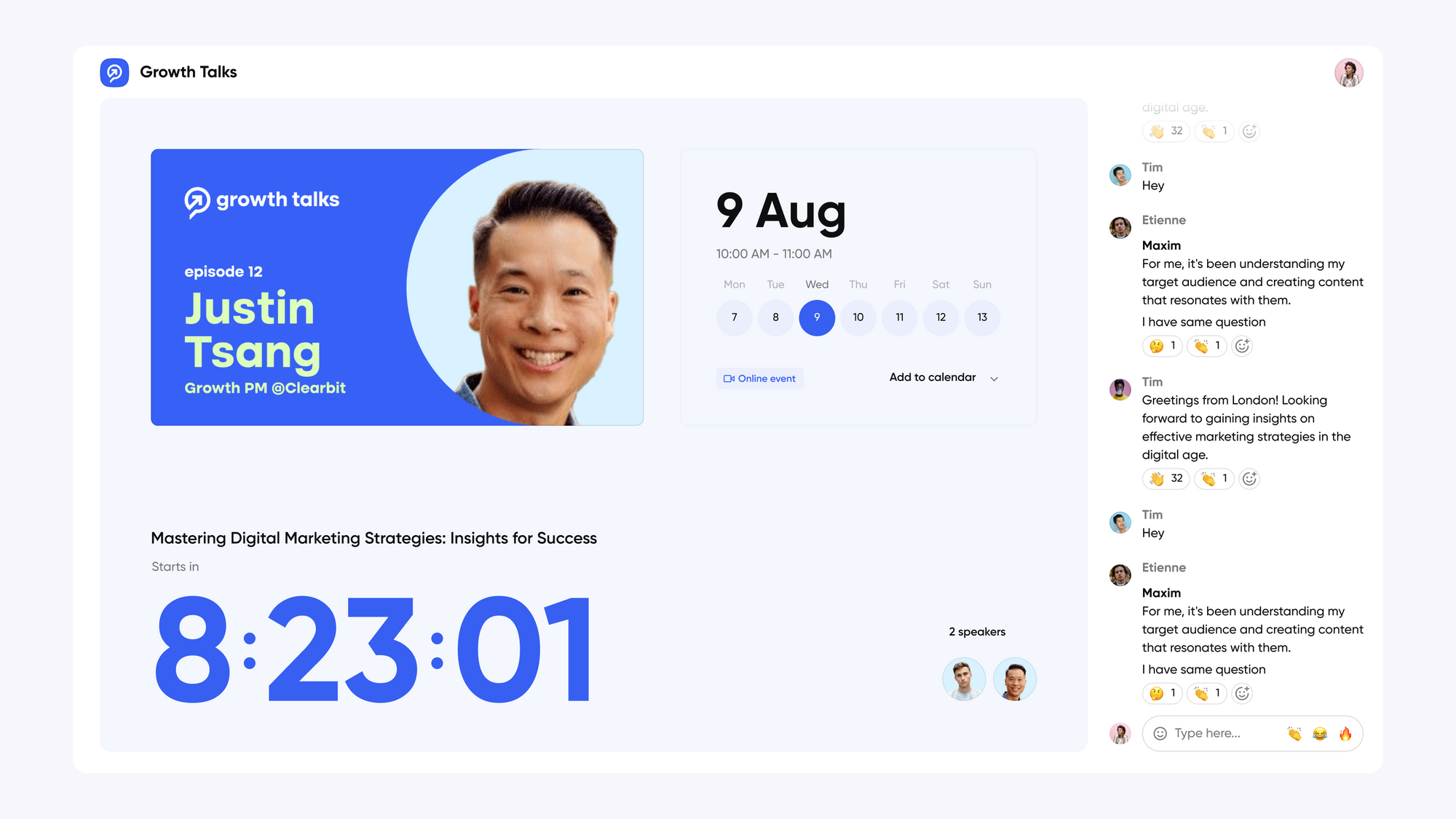
New: branded viewer experience

This week we launched an entirely new viewer experience.
We built it from the ground up, to look more modern and give you the ability to fully customize it using your brand's colors.
It's as easy as selecting your brand's colors. From here, using an algorithm we set the rest of your colors automatically.

Discover the new design on your registration pages, the webinar itself and of course your channel.
We think every brand should have the opportunity to express itself during their webinars. That's why we made it free on all plans.
Create your Contrast account now. No credit card needed.
