Contrast vs. Livestorm: A Comprehensive Comparison
We're a relatively new company and lots of people have asked us what's the difference between Contrast and Livestorm? And why should I even care about switching webinar platforms?
Just below you'll find three reasons why Livestorm customers are switching today to Contrast. If that's not enough (and we get it) then there's a lot more information just below that.
Of course, you can also sign up for a free account and experience the difference. No credit card needed ;-)
Why companies choose Contrast over Livestorm
Alright, if you don't feel like reading the almost 3000-word article. Here are the top 3 reasons why Livestorm customers are switching to Contrast.
- When it comes to delivering a branded and engaging experience to your audience, Contrast stands out as the preferred choice for marketers. As you can brand both the webinar video and the platform, the audience feels right at home. Rich engagement features help you have your audience watch until the end.
- Contrast is easy to use as they focus on great UX. By deciding not to build certain enterprise features, they keep the product easy to use.
- If you're using HubSpot, Contrast should be the webinar platform you choose. The Contrast app has a 4.9* rating vs. Livestorm with a 4.0* review.
Contrast brings a new vision of live video broadcasting. A vision that combines simplicity, beauty of content and performance management. I've been waiting for such a solution for years.
- Maxime Baumard, CMO at Pennylane
What makes Contrast and Livestorm different?
Ease of use: Contrast vs. Livestorm
Both companies offer a great product to host webinars their customers. For some people, Livestorm is the better solution because it offers very specific features or integrations. However, in terms of standard webinar functionalities, both platforms are comparable. To determine the best fit for your needs, it's important to understand where each platform shines.
Contrast is the better choice for marketers that are looking for an easy to use webinar platform. Contrast is a relatively new product with a strong focus on simplicity and great user experience. They want marketers to spend as little time setting up the webinar. And instead have them create great and engaging webinars.
Most people will find Livestorm harder to use.


Run Modern and Engaging Webinars
Contrast offers free plans with 30 registrants. No credit card needed.
Start for freeComparing webinar studios
The biggest differences between the two can be found when you compare their webinar studios. Both products have all the features you expect, such as chat, polls and Q&A. But the way the audience interacts with those features is entirely different.
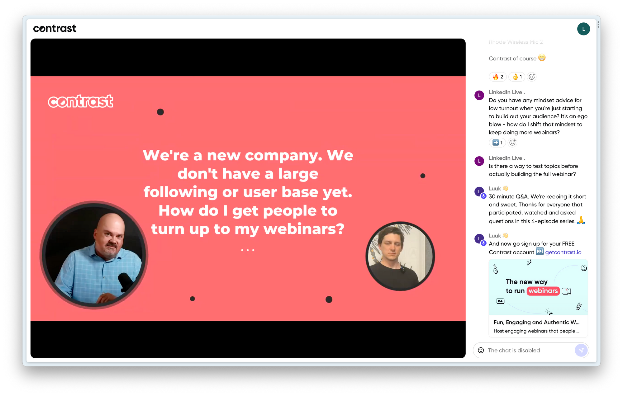
Contrast has chosen to give webinar hosts the ability to make every engagement feature a part of the video itself. Whereas on Livestorm these are hidden in menus.
Contrast believes that by making them a part of the webinar video, it completely changes the way people perceive your brand and webinar. Without any setup, it looks more professional and by adding your logo, colors and fonts you make it look exactly like your brand. And as these features are a part of the video, people will focus on them and thus engage more.
If you don't care about this and you simply want to deliver your message. Then you should read on to discover other differences between the two platforms and find the one that best suits your needs.
Integrations and CRMs
Livestorm offers a wider variety of native integrations, such as Mailchimp and Marketo. For some people, native integrations are a must-have, this is often the case for large enterprise companies. However, Contrast has Zapier and Make.com integrations that will do the trick for many people as well. These no-code tools enable you to integrate with your entire marketing stack at once.
People looking to integrate their webinar platform with their HubSpot CRM, should choose Contrast. Based on HubSpot Marketplace reviews, Contrast scores a 4.9 and Livestorm a 4.0-rating. If you want to understand what the HubSpot integration does, Maxim our head of growth wrote an entire article on it.
Contrast pricing vs Livestorm pricing
Looking at the pricing pages of these companies, we can say that Contrast is more affordable than Livestorm. For example, Contrast offers a plan at €75,- a month for 100 attendees. A similar plan on Livestorm costs €105,- a month. When you want let's say 500 registrants, this would cost €670,- a month on Livestorm. For €450,- a month, Contrast gives you 600 registrants.
Contrast also offers a free plan with up to 50 registrants, whereas Livestorm only allows up to 30 registrants.
All-in-all, Contrast is the more affordable webinar platform. The difference in price is likely caused by Contrast having very few employees and relying more on word-of-mouth marketing than Livestorm does.
Alright, let's sum up what we just discussed. Remember, this is just a high level overview. Below, you'll find a comparison in more detail.
Detailed comparison Livestorm vs. Contrast
| Contrast | Livestorm | |
|---|---|---|
| Basics | ||
| Team members | Unlimited | Unlimited |
| Free plan | 50 registrants | 30 registrants |
| 100 registrants | €75 p/m | €99 p/m |
| 500 registrants | €450 p/m (600 registrants) | €495 p/m |
| Basic features | ||
| Registration pages | X | X |
| Event reminders | X | X |
| Webinar studio | X | X |
| Brand | ||
| Logo | X | X |
| Colors | X | |
| Fonts | X | |
| Engagement | ||
| Q&A | X | X |
| Polls | X | X |
| CTAs | X | |
| Chat | X | X |
| Integrations | ||
| Availability | Few | Many |
| HubSpot CRM | 4.9 rating | 4.0 rating |
Let's zoom in on the details
How easy is it to setup a webinar?
Most customers that switched from Livestorm to Contrast say that the platform is easier to use. This helps them save time and focus on creating better and more engaging content.
Both platforms offer basic features such as registration pages, emails and event reminders. On both platforms there are ways to brand these to your liking.
Setting up a webinar is easy. It usually costs just a couple of minutes. On Contrast it's a little easier because they decided to hide most advanced options when you're setting up your webinar the first time. This means that within a couple of minutes you get a registration page that you can share with others.
We often hear that the registration pages on Contrast look more attuned to modern businesses. Those of Livestorm better suit more traditional businesses. What's cool about Livestorm's emails is that you can can tweak the CSS. Making them exactly look like your own emails. You'll need the help of a developer though.
Both platforms have out of the box reminders that you can easily setup and schedule a time to be sent out.
You're most likely not going to choose one platform over the other based only on how easy it is to setup your webinar. Most webinars platforms have this figured out. Most people tell us that the webinar experience itself is what makes them change. So let's dive into that now.
More info about webinar studios
As we said before, the biggest difference between Contrast and Livestorm is the webinar studio. A webinar studio is the part of the product that allows you to broadcast your webinar to your audience.
If you want to share a presentation, you can either use screen-share or upload a slide deck. Both platforms support this feature. The advantage of Contrast is that you can also add images, GIFs and videos to your deck very easily and mix these between your slides.
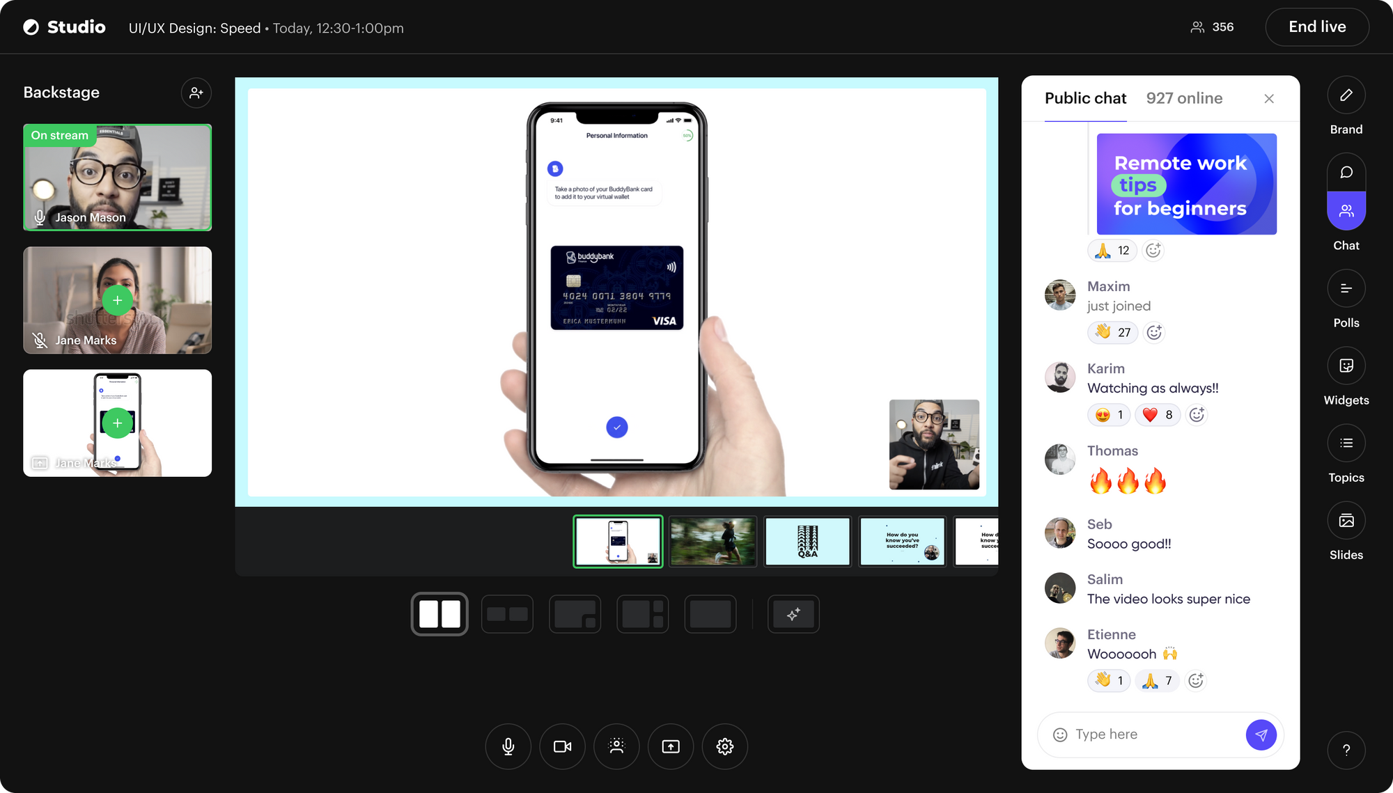
Branding then. Marketers, we heard you. You want to brand your webinar and the experience. Contrast gives you lots of options and flexibility in doing this. They allow you to upload your logo, choose your colors, font and select a theme that best suits your brand.
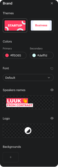
All of this is part of the video, which means that it contains your branding when you download the video. Perfect for YouTube or social media. It will immediately give that professional look and feel that you normally can only achieve by hiring a video editor.
Choosing the best webinar studio
Livestorm also has branding features. They give you the ability to upload your logo. There's a plugin available that allows you to change the color of the background of the application. But this doesn't always give great results. Finally, Livestorm allows you to host the webinars on your own domain. It's only available on their enterprise though, so it will come at a cost.
If you care about making your brand shine during your webinar, Contrast is the obvious choice for your webinar platform. Livestorm unfortunately offers too little branding features with just a logo and the ability to add plugins. Although custom domains is a powerful branding feature, at its current price it's simply too expensive for most companies.
Engaging with your audience
Ok, let's talk engagement in this Contrast vs. Livestorm comparison. If you go to either the Contrast or Livestorm websites you'll find the word engagement. That's expected, because it's the one thing that makes and breaks your webinars. But you might think, what does engagement really mean?
We can only speak for ourselves. We define engagement as anything that happens during a webinar that keeps people watching so you get the most value out of your webinar Great engagement helps you build better relationships with your audience. In the end, that should help you close deals faster.
Let's break down engagement for both platforms then. We must say, that Contrast, Livestorm and possibly Crowdcast have the best engagement features in the industry. The rest are still trying to catch up, or simply don't believe engagement to be important.
You'll find all the features you expect to engage your audience with. Chat, emoji reactions, Q&A and Polls. Livestorm is an older company than Contrast and they thus have had more time to develop other features. The most important ones that Contrast doesn't have are breakout rooms, video reactions and call-to-actions.
Contrast makes up for those features by giving you the ability to make them a part of your webinar. Questions are added on top of the webinar video, or polls next to your speakers. It looks professional and helps you build excitement around these key moments during your webinar.
Here's what Polls look like for example.
Livestorm also has features like Q&A or Polls. But they're all tucked away in a menu that people need to click on. It looks more dated and isn't great for interaction as people have to search for these features. And people that watch the replay (about 30% of your registrants!) don't get to experience these important moments at all. Contrary to Contrast, where these moments are a part of the video.
Finally, Contrast has a few features that you will not find on any other platform. Topics are full screen or lower-third animations that help you structure and pace your webinar. By animating them on top of the webinar, your audience always understands what you're talking about when. As a bonus, those Topics are used to mark key moments in your replay.
Engagement widgets show the most trending messages on stream. Or animate the webinar name and your company's socials. You can experience it for yourself.
So who has the better engagement features? Well, it's difficult. Livestorm has a couple of specific features such as call-to-actions that might help you engage your audience. If these are important to you, choose Livestorm. But the same could be said for Contrast's engagement widget such as Topics and Widgets.
If you want to maximize your engagement and create a unique experience that no other webinar platform offers with on-stream engagement, then Contrast is the better choice.
Alright, let's all put it on a table that's easy to understand.
| Contrast | Livestorm | |
|---|---|---|
| Webinar studio | X | X |
| Maximum speakers | 8 | 16 |
| Brand | ||
| Logos | X | X |
| Colors | X | Plugin only |
| Fonts | X | |
| Themes | X | |
| Custom backgrounds | X | |
| Virtual backgrounds | X | |
| Engagement | ||
| Polls | On-stream | Menu |
| Q&A | On-stream | Menu |
| Chat | X | X |
| Slides | PDFs, Images, GIFs, Videos | PDFs, PowerPoint |
| CTAs | X | |
| Widgets | X | |
| Topics | X | |
| Virtual whiteboard | Screen share only | Native |
Your attendee's point of view
People's expectations have changed. Some people say webinars are old school. We beg to differ. It's the webinar platforms that make webinars feel like that.
For far too long, webinars have just been a video with people and a chat. But if we zoom out (no pun intended) and look at video more broadly, we can see that things have changed.
From Instagram Live to Twitch and YouTube. These platforms feel modern and offer new ways of engaging your audience. In order to stay relevant to your audience, you need to deliver on these expectations.
What webinar looks and feels best for your audience depends on who your audience is. You're the expert here. So what we recommend is to sign up to one of the company's own webinars and experience the difference.
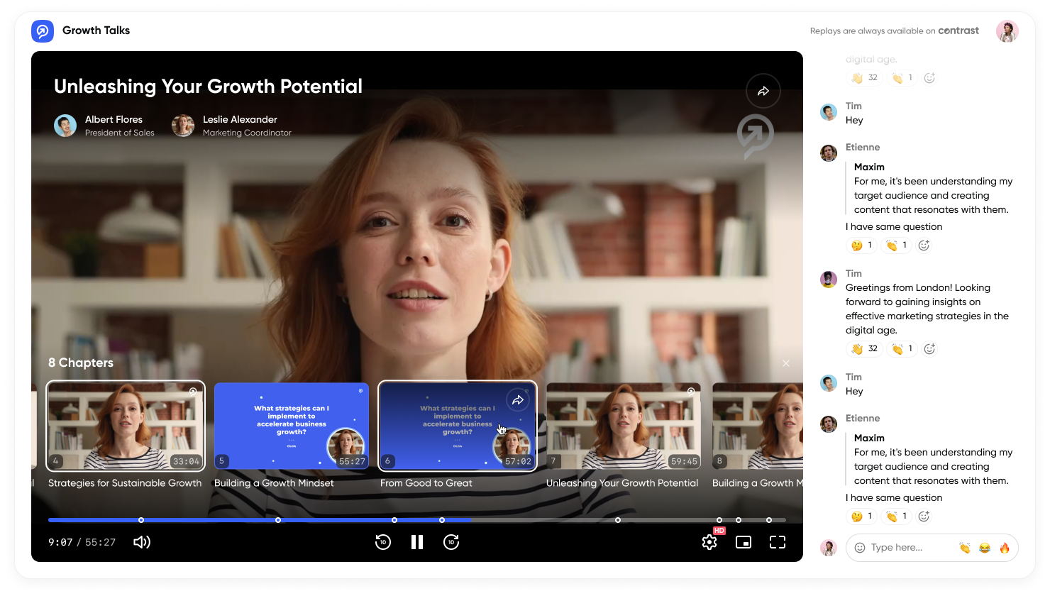
We'll make it easy for you. Experience Contrast here. And Livestorm here.
Get better insights and close deals faster
You've run your webinar. Now what? Great webinar platforms help you do two things when you're done running the webinar.
First of all, they help you understand how engaged people are with your webinars. This type of data helps you find what people find valuable and what not. You can use this information to improve future webinars. But also turn these into FAQ articles on for example your blog. Let's call this analytics.
Next to that, great webinar products help you get your data to your sales team. Ideally, as much data as possible as this will help your sales team personalize their approach. And this we can call data and integrations.
Let's start with analytics. Both platforms do well here. They tell you who registered, if they watched your webinar live or on replay. You can get these insights on a webinar level but also for your entire audience.
It's fair to say that Livestorm's funnel analytics are a little easier to understand than those of Contrast. But that's only before the webinar is supposed to go live.
For after the webinar, Contrast has more data points that are presented in a better way. The company drew a lot of inspiration from YouTube's analytics feature. It's easy to understand how long people watch your live webinar or replay. The parts they watched and skipped. And of course the polls they participated in.
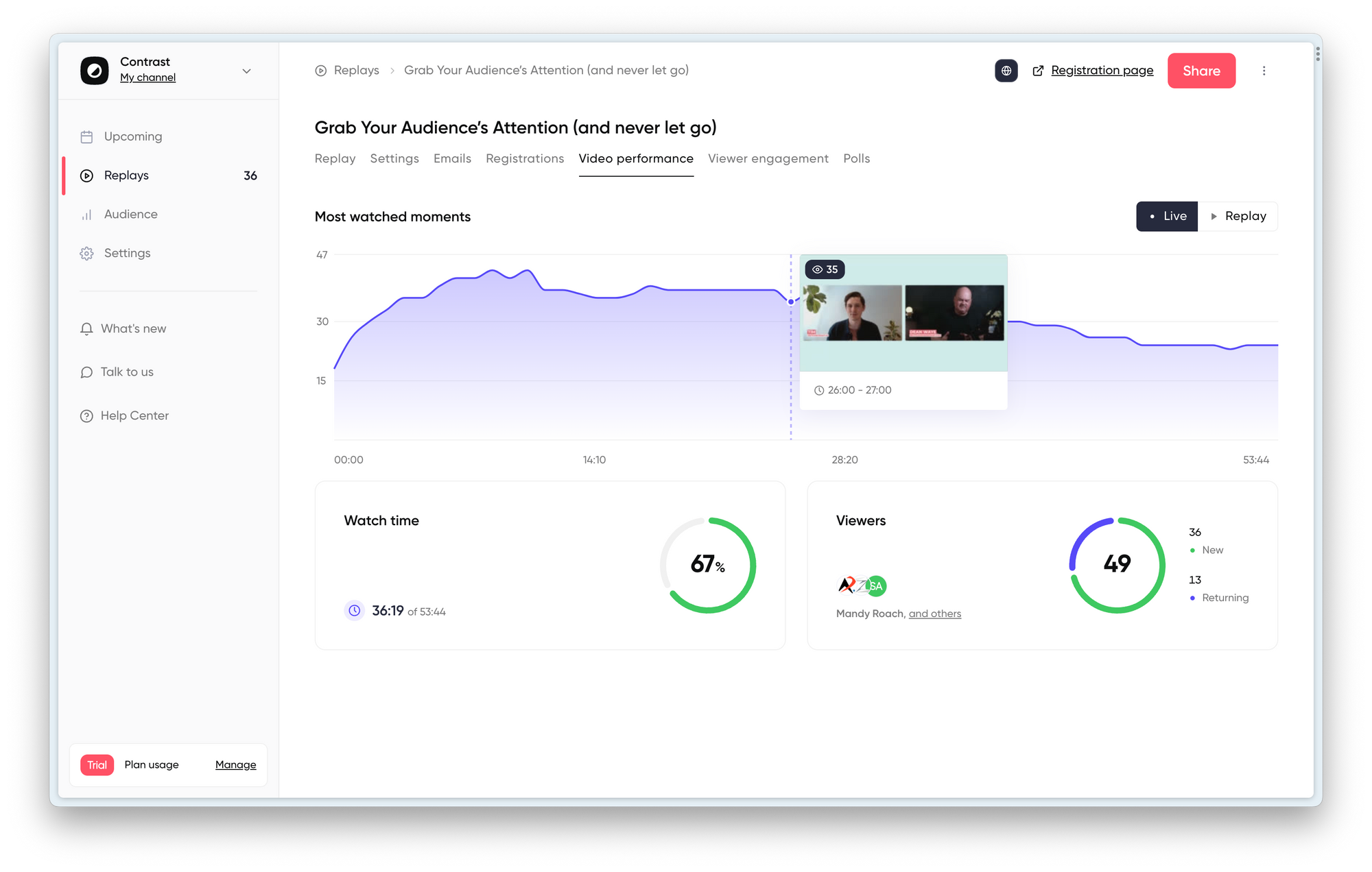
But all of this doesn't matter if your sales team doesn't have easy access to this data as well. So let's now talk data and integrations.
We'll be very honest. Livestorm has a lot more integrations than Contrast. You can find a list of their integrations on this link. But as always with integrations, you just need one or two, so you should always check if you really need all those integrations. The most important ones are CRM integrations.
Lots of the integrations you find on Livestorm are easily replicated through the Zapier and Make.com integrations from Contrast. For example, many of Contrast their customers use Zapier to send all registrants and view data directly to Salesforce.
Others use Zapier to register people to Contrast without using the Contrast registration form. With tools like Zapier and Make the possibilities are endless and there's a far smaller needed for native integrations.
Of course we have both video and text tutorials on how to do that. We're also happy to set things up together with you.
A word on people that use HubSpot CRM. Your best choice is Contrast. The reviews speak for themself. If you want to understand how you can empower your webinar strategy with the HubSpot integration, here's an article that helps you get started.
What platform is the best for you
We hope this Contrast vs. Livestorm comparison was useful. So let's wrap it up. Put very simply, Livestorm shines with large enterprise customers. They have a lot of features and integrations. However, most smaller and medium sized companies don't need all of these. Because there are so many features, it's more difficult to use Livestorm than Contrast.
Livestorm has been around for a while now. They have a more oldschool approach to webinars. There's nothing wrong with that. But for many younger and modern startups, Livestorm might feel a touch outdated.
If you're looking to deliver a modern webinar experience that feels both engaging and like your brand. You should choose Contrast. The company has an advantage, as they had the opportunity to learn from the mistakes of other webinar products but also products like YouTube and Twitch.
Running webinars on contrast is simple and your team will be set up in minutes. Your attendees will experience a webinar they've not seen before, helping you build better relationships with them.


Run Modern and Engaging Webinars
Contrast offers free plans with 30 registrants. No credit card needed.
Start for free