Webinar CTA Examples: 25 High-Converting Ideas

Most webinars fail for one simple reason. The call to action is weak, vague, or mistimed.
A webinar CTA determines whether attention turns into pipeline or disappears the moment the session ends.
You can have a great topic, strong promotion, and a polished presentation. But if your call to action is misaligned with your audience’s intent, all those registrations mean nothing.
A high-performing webinar CTA turns attention into action.
Below you’ll find 25 high-converting webinar CTA examples you can use for registration pages, live sessions, and post-webinar follow-ups. Whether you need a CTA for webinar registration, engagement, or demo bookings, these examples are organized by funnel stage so you can copy, adapt, and improve performance immediately.
Prefer to watch instead?
We break down the strategy behind high-converting webinar CTAs in this video:
Or keep reading for the full breakdown and 25 real examples.
What is a webinar CTA?
A webinar CTA (or call to action) is the prompt that tells your audience what to do next.
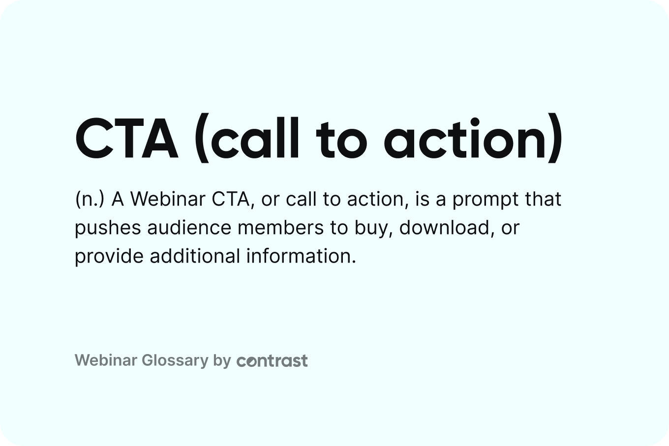
It can show up before the webinar, during the session, or after it ends. It might ask someone to register, download a guide, book a demo, start a free trial, or watch the replay. The goal is simple. Move the attendee one step forward.
In the context of webinars, a CTA is usually a button or clear prompt with direct, action-focused text. For example, “Book a Demo,” “Download Whitepaper,” or “Start Free Trial.”
A strong CTA for a webinar removes friction and makes the next step obvious.
Why Webinar CTAs Have Such a Big Impact on Conversion Rates
Webinars create focused attention. For 30 to 60 minutes, you have someone actively listening.
But attention fades fast once the session ends.
A webinar CTA captures that momentum while it still exists. It gives attendees a clear next step while your message is fresh.
Without a clear CTA, even interested attendees do nothing. They close the tab. They move on. The opportunity disappears.
Strong webinar CTAs do three things:
- They make the next step obvious
- They match the intent of the audience at that moment
- They remove friction from taking action
That’s why small changes in CTA wording can impact webinar conversion rates. A vague “Submit” button creates hesitation. A specific “Book My Demo” is intentional and clear.
CTAs also make performance measurable. When you track clicks, demo bookings, or trial starts tied to a webinar CTA, you can see exactly how your session contributes to revenue.
Webinars generate attention. Webinar CTAs turn that attention into results.
Types of Webinar CTAs (25 Examples You Can Copy)
Not all webinar CTAs serve the same purpose.
Some are designed to increase registrations. Others drive engagement during the session. Some are built to generate pipeline after the webinar ends.
Below are 25 examples organized by type, funnel stage, timing, and goal.
Top-of-Funnel Webinar CTA Examples (Registration & Awareness)
These webinar CTAs are designed to convert visitors into registrants. They typically appear on landing pages, in promotional emails, or in paid ads before the webinar begins.
| CTA Example | Type | When to Use It | Primary Goal |
|---|---|---|---|
| “Save My Seat” | Registration | Landing page | Increase signups |
| “Register” | Registration | Landing page or email | Drive action quickly |
| “Join Live” | Registration | Event promotion | Emphasize real-time value |
| “Register Free” | Registration | Paid ads | Reduce friction |
| “Reserve My Spot” | Registration | Social posts | Create ownership |
| “Watch Now” | On-demand webinar | Replay page | Capture leads |
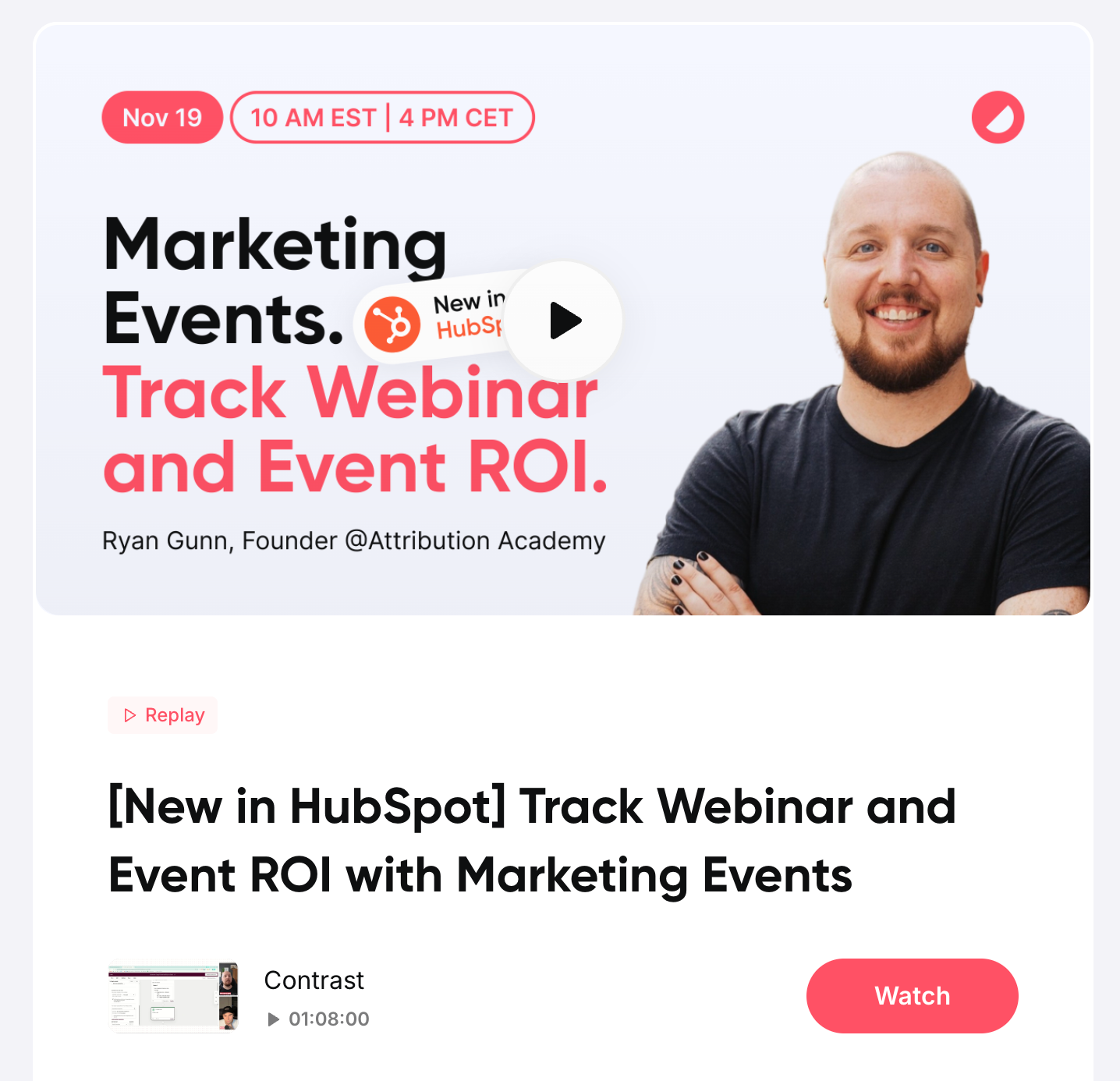
Pre-Webinar CTA Examples in Promotional Images
Top-of-funnel webinar CTAs are not limited to landing page buttons. Promotional images used in social posts, ads, and email banners can also function as strong registration CTAs.
For example, a webinar promotional graphic might include a clear call to action such as:
“Claim Your Spot”
When the CTA is embedded directly in the image, it reinforces urgency and makes the action visually obvious. Using high-contrast colors, button styling, and action-oriented wording helps signal that the image is clickable and tied to registration.
This type of webinar registration CTA works especially well for:
- LinkedIn promotion
- Paid social ads
- Event announcement posts
- Email header banners
Instead of relying only on a caption link, the visual CTA strengthens intent and increases click-through rates.

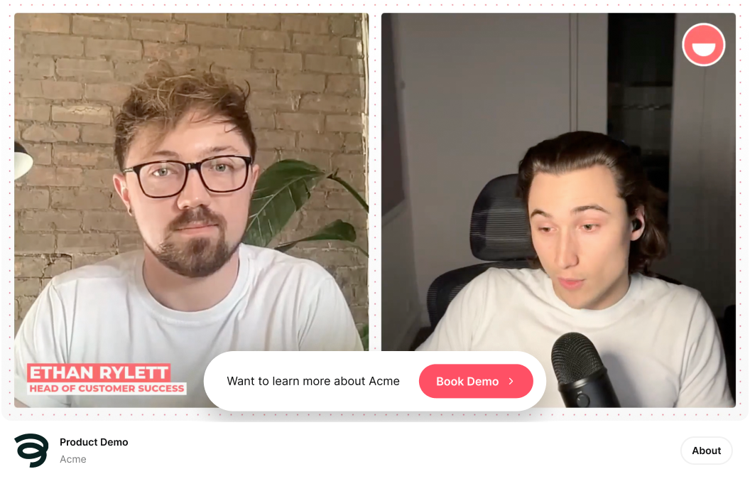
Mid-Funnel Webinar CTA Examples (Engagement & Education)
These webinar CTAs appear during the live session. Their goal is to increase engagement, reinforce value, and guide attendees toward deeper interest without pushing too hard.
They work best when tied to a moment in the presentation. After a key insight. During a product walkthrough. Right before Q&A.
| CTA Example | Type | When to Use It | Primary Goal |
|---|---|---|---|
| “Download” | Resource | After key section | Reinforce value |
| “Visit Site” | Exploration | During product mention | Encourage deeper discovery |
| “Read Case Study” | Education | After sharing results | Deepen credibility |
| “Explore Feature” | Product interest | During demo | Warm up buyers |
| “Get Template” | Resource | After framework explanation | Deliver tangible value |
| “Connect on LinkedIn” | Relationship | During presentation | Build long-term relationship |
| “Pick Topic” | Interactive engagement | Mid-session poll | Capture interest signals |
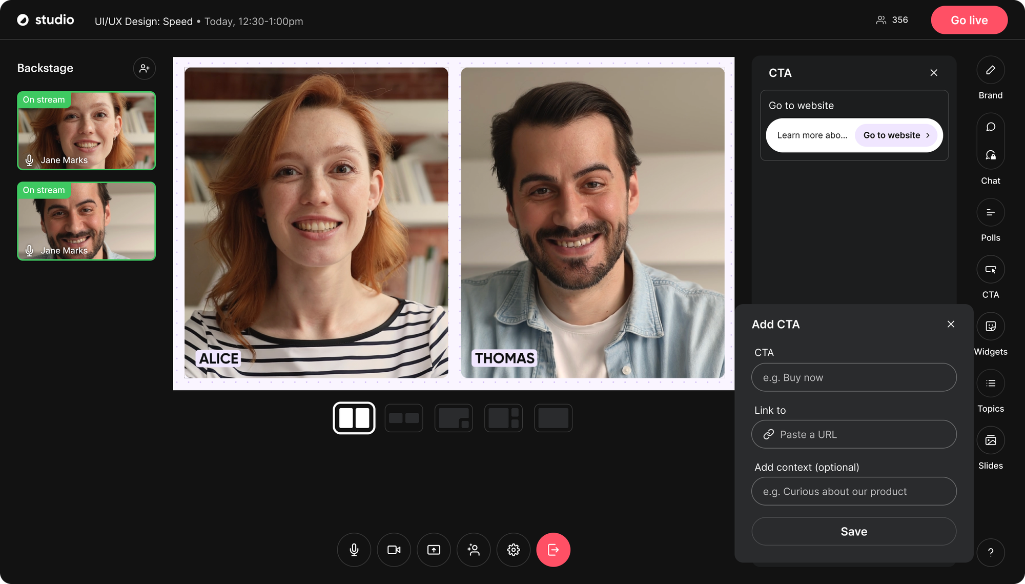
In-Webinar CTA Examples Using Polls
Not all webinar CTAs need to be buttons. Interactive elements like polls can function as powerful in-session webinar CTA examples.
For example, you might ask:
“Which design topic would you like to explore next?”
When attendees respond, they signal interest without leaving the webinar. That response can then guide a targeted follow-up CTA such as “Download the Guide,” “Explore the Feature,” or “Book a Demo.”
Poll-based webinar CTAs work especially well because they:
- Increase engagement during the session
- Reduce friction compared to clicking away
- Capture buying signals in real time
- Allow you to segment follow-up messaging
Instead of pushing a direct sales CTA too early, polls warm up intent and guide attendees toward the right next step.

Bottom-Funnel Webinar CTA Examples (Conversion & Pipeline)
These webinar CTAs are designed to turn interest into action.
They usually appear near the end of the session, during a product walkthrough, or immediately after delivering your strongest value. At this stage, attendees understand the problem and the solution. The CTA should make the next step clear and easy.
| CTA Example | Type | When to Use It | Primary Goal |
|---|---|---|---|
| “Start Free Trial” | Activation | End of webinar | Drive product adoption |
| “Book a Demo” | Consultation | After Q&A | Generate qualified meetings |
| “Sign Up” | Conversion | After presenting offer | Convert warm leads |
| “Upgrade Now” | Upsell | During feature comparison | Increase revenue |
| “Request Pricing” | Sales inquiry | During offer mention | Capture buying intent |
| “Talk to Sales” | Direct conversion | Final slide | Capture high-intent leads |
Bottom-Funnel CTA Example on an Offer Slide
At the end of a webinar, your most important CTA often appears on a dedicated offer slide. This is where you clearly explain the next step and make it easy to act.
For example, your final slide might include:
- A clear headline summarizing the value
- One primary CTA such as “Book a Demo” or “Start Free Trial”
- A short reminder of what happens next
- A visible URL or clickable in-session button
Unlike mid-funnel CTAs, bottom-funnel webinar CTAs should be direct and decisive. Attendees at this stage understand the problem and the solution. The goal is to convert interest into pipeline.
Effective bottom-funnel CTAs work because they:
- Focus on one primary action
- Reduce friction in the next step
- Clarify what happens after clicking
- Avoid competing options
Instead of listing multiple actions, a strong closing CTA slide guides attendees toward one clear conversion path.
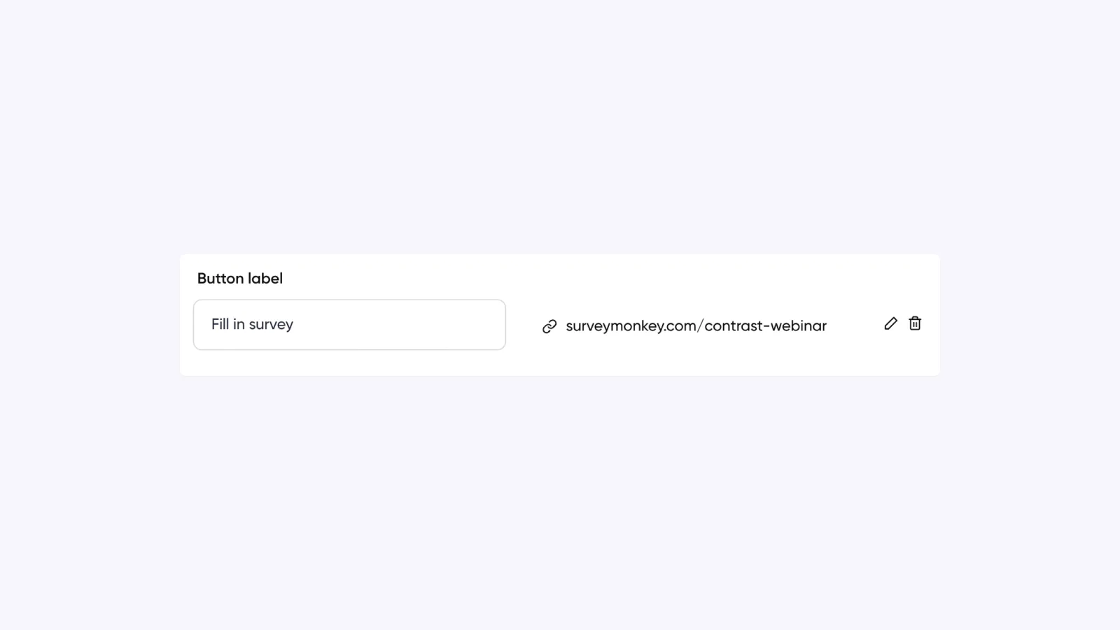
Post-Webinar CTA Examples (Replay & Follow-Up)
Post-webinar CTAs appear after the live session ends. They are used in replay pages, follow-up emails, and retargeting campaigns.
Their goal is simple. Capture the value of the session while it is still fresh.
Some attendees were interested but not ready to act during the webinar. Post-webinar CTAs give them another opportunity to take the next step.
| CTA Example | Type | When to Use It | Primary Goal |
|---|---|---|---|
| “Watch On-Demand” | Replay access | Follow-up email | Capture non-attendees |
| “View Replay” | Replay access | Thank-you page | Extend session value |
| “Take Survey” | Feedback | Post-webinar email | Gather insights & engagement |
| “Join Our Community” | Relationship | Follow-up sequence | Build long-term engagement |
| “Subscribe to Our Blog” | Nurture | Post-webinar email | Continue education |
| “Join Our Next Webinar” | Retention | End of follow-up | Drive repeat attendance |
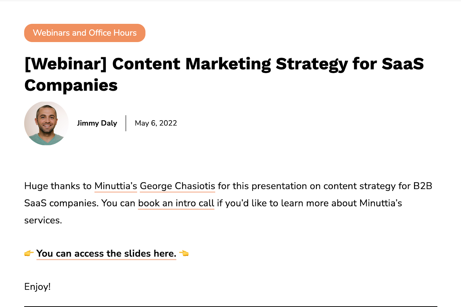
Post-Webinar CTA Examples in Follow-Up Emails
Post-webinar CTAs often perform best inside follow-up emails. After the session ends, email becomes the primary channel for capturing missed intent and reinforcing next steps.
For example, a post-webinar email might include:
- A primary CTA such as “View the Presentation Deck”
- A secondary CTA such as “Book an Intro Call”
- A replay CTA such as “Watch On-Demand”
Strong post-webinar email CTAs use clear formatting to guide attention. Strategic whitespace, bold text, and simple button styling help the call to action stand out without relying on complex graphics that may break across email clients.
Well-designed webinar follow-up CTAs work because they:
- Capture intent while the session is still fresh
- Offer immediate value before asking for a commitment
- Segment high-intent leads from passive viewers
- Remain compatible across email platforms
Instead of overwhelming attendees with multiple competing actions, a focused email CTA guides them toward one clear next step.
How to Write a High-Converting Webinar CTA
Good webinar CTAs are not clever. They are clear.
If someone has to think about what your button means, conversion drops. The best CTAs remove doubt and make the next step obvious.
Here are the principles behind high-performing webinar CTAs.
1. Match the CTA to the Funnel Stage
A registration CTA should feel low commitment. A bottom-funnel CTA can ask for more.
For example:
- Top of funnel: “Register Free”
- Mid funnel: “Explore the Feature”
- Bottom funnel: “Book a Demo”
Using a hard sales CTA too early creates friction. Using a soft CTA too late wastes intent.
2. Be Specific About the Action
Generic buttons like “Submit” or “Click Here” lower conversions.
Specific CTAs perform better because they reduce uncertainty:
- “Book a Call”
- “Watch On-Demand”
- “Download Guide”
Weak vs Strong Webinar CTA Examples
Weak CTA: Submit
Strong CTA: Register
Weak CTA: Learn More
Strong CTA: Watch the Demo
Weak CTA: Click Here
Strong CTA: Start Free Trial
Specific webinar CTA examples outperform generic button text because they reduce uncertainty and clarify the outcome.
3. Make the Outcome Obvious
A strong CTA does not just tell people what to do. It tells what they will get.
For example:
- “Get the Template”
- “Start Free Trial”
- “Join Our Community”
Each one implies a clear benefit. When the outcome is visible, the action feels more valuable.
4. Reduce Friction
If something is free, say it.
If it takes five minutes, say it.
Clarity reduces hesitation. The less risk people perceive, the more likely they are to act.
5. Keep It Short
Most high-converting webinar CTAs are one to three words.
Short text is easier to scan and feels more decisive.
Webinar CTA Copy Frameworks (Turn Any Offer Into a High-Converting CTA)
Most high-performing webinar CTAs follow simple patterns. Instead of guessing, use one of these frameworks and adapt it to your offer.
| Framework | Structure | Example | When to Use It |
|---|---|---|---|
| Direct Action | Verb only | “Register” | High-intent audiences |
| Clear Outcome | Verb + result | “Get the Template” | When benefit is clear |
| Ownership | Verb + my / your | “Save My Seat” | Registration pages |
| Urgency | Verb + time cue | “Register Now” | Limited-time offers |
| Low Friction | Verb + ease signal | “Book a 15-Minute Call” | Cold or hesitant leads |
Strong webinar CTA examples usually fit one of these patterns. The wording changes, but the structure stays consistent.
How to Track Webinar CTA Conversions
Writing a strong webinar CTA is only half the work. You also need to measure whether it performs.
The simplest way to track webinar CTA effectiveness is to measure conversions at each stage of the funnel.
1. Track Registration Conversion Rate
For top-of-funnel CTAs, measure:
Registrations ÷ Landing page visitors
This tells you how effective your registration CTA is. Small wording changes like “Register” versus “Register Free” can move this number.
If you want a deeper breakdown of performance metrics beyond CTAs, see our guide to webinar KPIs.
If conversion is low, the issue may be:
- Weak headline alignment
- Friction in the form
- Unclear value proposition
2. Track In-Webinar CTA Click Rate
For mid- and bottom-funnel CTAs shown during the session, measure:
CTA clicks ÷ Live attendees
This shows whether your timing and message match audience intent.
If clicks are low, consider:
- Triggering the CTA later
- Reinforcing it verbally
- Reducing competing CTAs
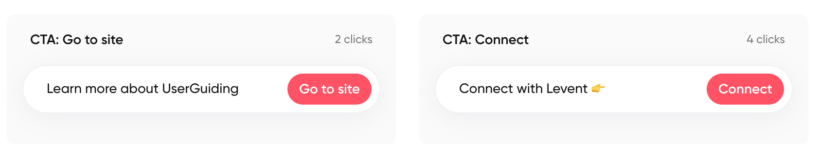
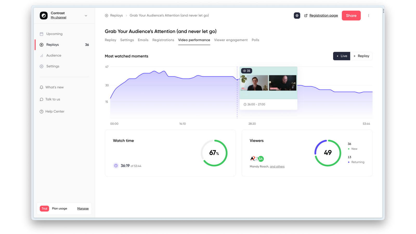
The best webinar software tracks in-session CTA clicks automatically. Platforms like Contrast allow you to see exactly how many attendees interacted with each CTA during the event.

Get More Insights From Your Webinars
Start for free up to 30 registrants. No credit card needed.
Start for free3. Track Post-Webinar Conversions
After the session ends, measure:
- Replay views
- Survey completions
- Trial starts
- Demo bookings
- Sign-ups
Segment your data by:
- Attended live
- Registered but did not attend
Post-webinar behavior often differs between these groups.
4. Track Final Conversion, Not Just Clicks
Clicks matter. Conversions matter more. Use tracking links or analytics tools to measure how many attendees who clicked your webinar CTA actually completed the next step.
For example:
- Trial activation
- Meeting booked
- Account created
- Purchase completed
This tells you which webinar CTA examples generate revenue, not just engagement.
5. Compare Webinars Over Time
Do not evaluate one webinar in isolation. Compare:
- CTA click rates
- Registration conversion rates
- Revenue generated
Over time, this reveals which topics, formats, and CTA styles perform best.
Webinar CTA Mistakes to Avoid
Even strong webinars underperform because of small CTA mistakes. Here are the most common issues that lower webinar conversion rates.
1. Using Generic Button Text
Buttons like:
- “Submit”
- “Click Here”
- “Learn More”
do not tell attendees what will happen next.
A webinar CTA should clearly state the action:
- “Register”
- “Start Free Trial”
- “Book a Call”
If the action is unclear, hesitation increases.
2. Asking for Too Much, Too Early
Pushing a hard sales CTA before delivering value creates friction.
For example:
- Asking attendees to “Talk to Sales” in the first 10 minutes
- Promoting pricing before explaining the solution
Match the CTA to the funnel stage. Build trust first.
3. Using the Same CTA Everywhere
Many teams use one CTA across:
- Registration page
- During the webinar
- Follow-up emails
That misses intent shifts. A registration CTA is different from a conversion CTA. A replay CTA is different from a demo CTA. Context matters.
4. Overloading the Webinar With CTAs
Too many competing calls to action create confusion.
If attendees see:
- Download
- Demo
- Trial
- Pricing
- Community
all at once, decision fatigue increases. One clear next step performs better than five.
5. Not Measuring Performance
If you are not tracking clicks and conversions tied to your webinar CTA, you cannot improve it. Strong CTA strategy requires testing and iteration.
Frequently Asked Questions About Webinar CTAs
What is the best CTA for a webinar?
The best webinar CTA depends on the funnel stage. For registration pages, low-friction CTAs like “Register Free” or “Save My Seat” tend to perform best. During the session, engagement CTAs such as “Download the Template” or “Explore the Feature” work well. At the end of the webinar, stronger conversion CTAs like “Start Free Trial” or “Book a Demo” are more effective.
Where should a webinar CTA appear?
A webinar CTA can appear on the registration landing page, during the live webinar session, and in post-webinar follow-up emails. High-performing webinar strategies use different calls to action at each stage rather than repeating the same CTA everywhere.
What makes a webinar CTA high converting?
A high-converting webinar CTA is clear, specific, and aligned with audience intent. It removes friction, communicates what will happen after clicking, and matches the stage of the funnel. Strong webinar CTA examples use direct verbs and avoid vague button text like “Submit” or “Click Here.”
How many CTAs should a webinar have?
Each stage of the webinar lifecycle should have one primary CTA. Registration, in-session engagement, and post-webinar follow-up can each use a different call to action. However, presenting too many competing CTAs at the same time can reduce conversion rates.
Improve Webinar Conversion
Start for free with up to 50 registrants. No credit card is needed.
Start for free